Bologna logo and symbol, meaning, history, PNG
- Download PNG Bologna Logo PNG The Italian football club Bologna based in Bologna, Emilia-Romagna, was established in 1909.
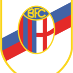
- Meaning and history 1946 — 1991 Although the Bologna logo has undergone a lot of modifications, for most of its history, it has had the same structure and core elements.
- The reason why these colors had been chosen was pretty simple – they came from the official palette of the city of Bologna.
- It can be seen on both the flag and the coat of arms of the city of Bologna, as well as many other cities in Italy and other countries, to say nothing of England, which has the red cross on its flag.
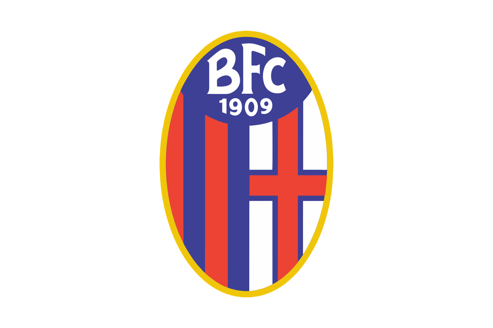
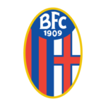
- 1993 — 2018 The Bologna logo, created in 1993, stayed with the club for more than two decades and became a basis for the current emblem of the Italian football team.
- The left one, with the vertical blue and red striped pattern, and the right one with a Red Cross in a blue outline, set on a white background.
- The upper part of the crest was colored solid blue and had a fancy white “BFC” lettering set in all capitals of a handwritten typeface, and complemented by the bold white “1909” datemark.
- 2018 — Today The redesign of 2018 left all the elements of the Bologna Football Club’s visual identity almost untouched.
- The contours were refined and strengthened, but the concept and disposition were not changed.
- There are still red and white shades on the BFC logo, but red turned into burgundy, and blue is now used in its darkest shade possible, looking more black.
- Colors The color scheme has been undoubtedly inspired by that of the coat of arms of the city of Bologna.
- All the four colors – red, blue, white, and yellow – appear on the city’s crest.
- The football logo, though, is simpler.
- It doesn’t have, for instance, the diversity of shades of yellow that the city’s coat of arms boasts.





Leave a Review