Bob the Builder Logo
- Download PNG Bob the Builder Logo PNG Bob the Builder is a British animation show for kids, which was released in 1998 and tells about Bob, who helps to build and renovate different projects.
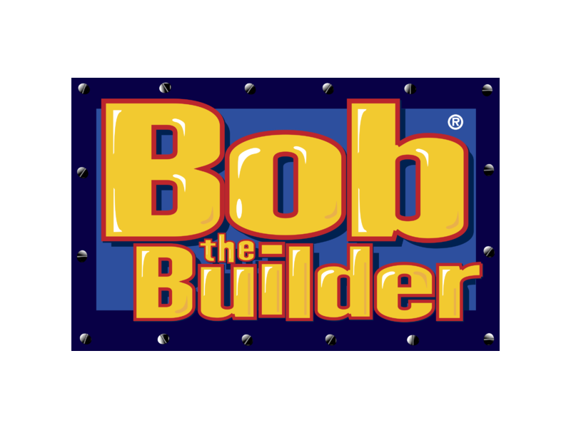
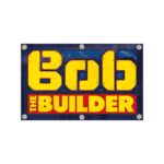
- The Bob the Builder logo is composed of a rectangular with a wordmark on it.
- And has a diagonal grid pattern.
- The most important element of the TV-show’s visual identity is its wordmark.
- It is executed in a custom condensed font, with thick geometric lines and a thin red outline for the “Bob” part.
- “The Builder” is written in a more traditional sans serif typeface and placed inside a red rectangle, where “The” is smaller and placed vertically.
- The blue yellow and red color palette of the Bob the Builder logo evokes a happy and welcoming feeling.
- It is funny, it is bright and it is instantly recognizable and loved by kids across the globe.





Leave a Review