evolution history and meaning
- Download PNG Blackpink Logo PNG Blackpink is the name of the Korean music-band, which was formed in 2016 and released their first album in the same year.
- The group consists of four girls, who are incredibly popular in the social media.
- The Blackpink music genre is k-pop.
- Meaning and history Blackpink is a band with a very distinct image.
- It is young, it is energetic, it is stylish.
- The band’s visual identity is a perfect accompaniment to its character and music genre.
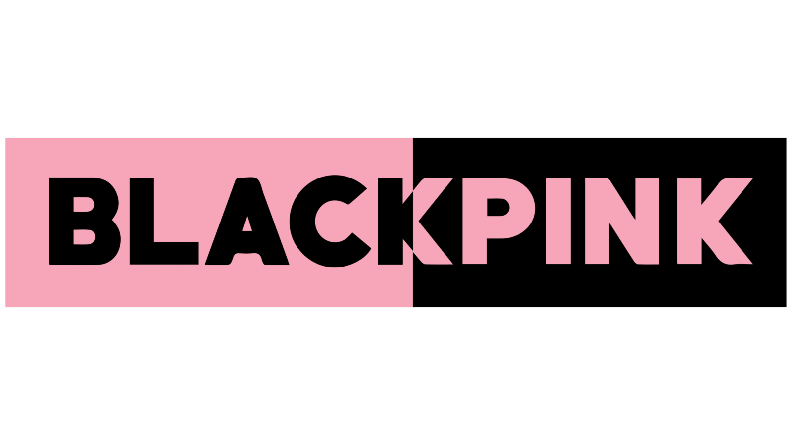
- The Blackpink logo is composed of a wordmark, that is placed on a rectangular background.
- The color palette of the logo is black and pink, where the nameplate and the background usually alternate its’ colors.
- The traditional Helvetica typeface of the all-caps lettering is balanced by reversed letters “C” and “N”, and “A” without its horizontal bar.
- Font and color The stylish and modern BlackPink logotype is executed in a bold geometric sans-serif typeface with clean thick lines and straight cuts of the letters.
- The fonts, which are pretty similar to the band’s logo are Draft B Extra Bold and Enamelplate B, but it looks unique and memorable due to some extra details.
- The horizontal bar of the letter “A” is to move, which adds sharpness and makes the whole logo more angular, and the mirrored “C” and “N” add charm and playfulness.
- The band’s official color palette is based on the shades, which compose its name — black and pink.
- The minimalist logo is available in three different color combinations — monochrome, light pink on white, and pink and black.


Leave a Review