Chicago Blackhawks logo and symbol, meaning, history, PNG
- Meaning and history The visual identity of the hockey club from Illinois has always been pretty constant in terms of geometric shapes and symbols, though the color palette of its circular badge was being switched from redesign to redesign, so throughout the years, there were six different versions of the shades and tones.
- The only emblem, different from the others is the one, introduced by the team in the middle of the 1960s and still in use by the Chicago Blackhawks.
- 1926 — 1935 The original circular badge of Chicago Blackhawks was introduced in 1926 and featured a Native American man profile, turned to the left, drawn in thin white lines on a black background, and enclosed into a wide double frame with the bold capitalized inscription around its perimeter.
- The wordmark was visually split into two parts with the “Black Hawks” arched on top, and “Chicago” along the bottom side of the frame.
- 1935 — 1937 The redesign of 1935 switched the color palette of the team’s logo from monochrome to black, white, burgundy, and beige, where the last two shades were used for coloring the Native American man from the badge, 1937 — 1941 The background of the inner circle was switched from black to white, making the whole badge look airier and fresher, though it still stayed powerful and masculine, keeping all the other elements untouched.
- 1941 — 1955 The redesign of 1941 brought new colors and contours to the Black Hawks’ visual identity, outlining the circular badge in white and red and redrawing the Indian man in yellow, green, and black, with white and red feathers in his hair.
- The feathers were now cold sore red, green, and yellow, and the face of the Native American man had some red and yellow ornaments.
- As for the inscription, it has changed its typeface to a more modern geometric one, though the color palette of the framing remained untouched, besides the white outline, which was removed on this version.
- 1957 — 1965 The contours of the Indian’s profile were refined again, and one of the red feathers got changed to an orange one, the lines of the portrait became wider and shorter, which added more balance to the circular logo, distributing the brier negative space in a more harmonized way.
- The wordmark remained untouched, as well as the color palette of the other elements on the logo.
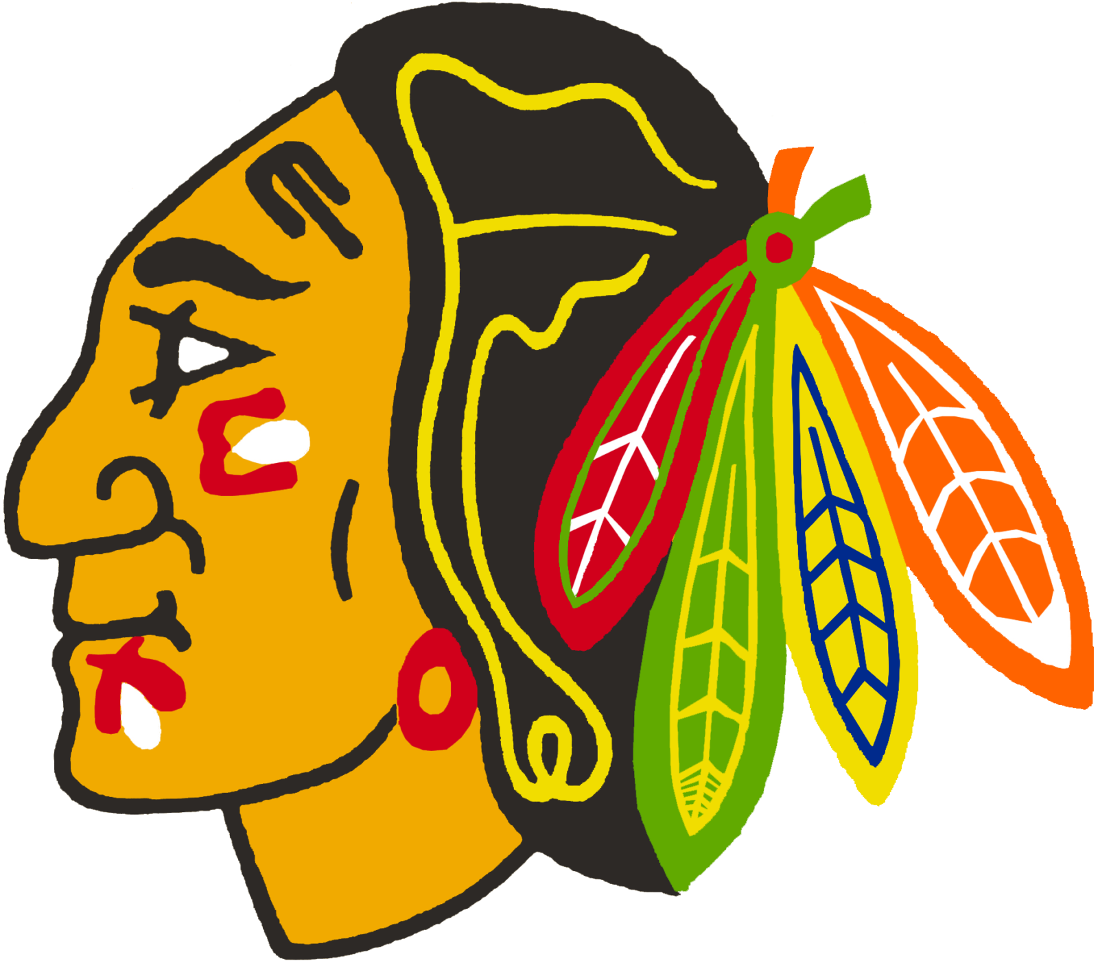
- 1965 — Today The redesign of 1965 brought to Chicago Blackhawks the version of the logo we all can see today.
- As for the colors of the visual identity, the palette is slightly elevated and uses bright shades along beside and black ones.
- The red, green, yellow, and orange feathers in the Indian hair make the whole image vivid and dynamic.
- Current emblem The latest notable update took place in 1999.
- It included just a slight shift in the color scheme: the face grew darker, while the outline was colored in a brighter shade of yellow.
- The green, the yellow, and the blue colors of the feathers also became brighter.
- Color From the point of view of the color scheme, the current Chicago Blackhawks logo is rather rich.
- The war paint on the face of the Indian is red, black, and white, while the feathers feature red, green, blue, white, yellow, and orange.
- The team’s official colors are red, black, and white.
- Chicago Blackhawks Colors RED PANTONE: PMS 186 C HEX COLOR: #CF0A2C; RGB: (207,10,44) CMYK: (2,100,85,6) ORANGE PANTONE: PMS 165 C HEX COLOR: #FF671B; RGB: (255,103,27) HSB: (19,89,100) CMYK: (0,74,98,0) GREEN PANTONE: PMS 348 C HEX COLOR: #00833E; RGB: (0,131,62) CMYK: (96,02,100,12) YELLOW PANTONE: 109 C HEX COLOR: #FFD100; RGB: (255,209,0) CMYK: (0,9,100,0) TAN PANTONE: PMS 131 C HEX COLOR: #D18A00; RGB: (209,138,0) HSB: (39,100,81) CMYK: (17,49,100,2) BLUE PANTONE: PMS 2747 HEX COLOR: #001970; RGB: (0,25,112) HSB: (225,100,43) CMYK: (100,96,24,21) BLACK HEX COLOR: #000000; RGB: (0,0,0) HSB: (225,100,0) CMYK: (75,68,67,90) WHITE HEX COLOR: #FFFFFF; RGB: (255,255,255) HSB: (225,0,100) CMYK: (0,0,0,0) Video


Leave a Review