Birmingham Bowl Logo
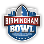
- Download PNG Birmingham Bowl Logo PNG Since 2011, when the Birmingham Bowl was played for the first time under its current name, its emblem has remained unchanged.
- In this description, we do not take into consideration the period when the game was known as PapaJohns.com Bowl (2006–2010) and had a different brand identity.
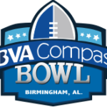
- It is a modern and stylish crest, with the bottom part in solid blue, a gradient extra-bold serif “Bowl” in all capitals, followed by the thin uppercase motto in a classy font, and a red “Birmingham” banner above it.
- On the upper part of the badge there is a gray and blue rugby ball coming out from the shield, and set over the gray and blue landscape of the city.
- 2015 At the very center of the Birmingham Bowl logo, there is the name of the game.
- Both the words are given in white, but the word “Bowl” features a gray gradient, due to which it gets some dimension.
- The lettering “Birmingham” also gets an individual style due to the choice of type and the varying size of the letters.
- Above the lettering, there are a stylized football in blue and grey and the skyline of Birmingham.




Leave a Review