Bic logo and symbol, meaning, history, PNG
- Download PNG Bic Logo PNG The Bic logo is yet another example of outstanding brand consistency.
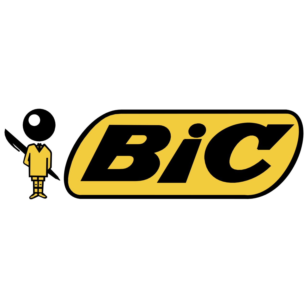
- The funny guy with a ballpoint pen ball instead of the head has been part of the emblem for more than half a century.
- Meaning and history Société BIC S.A. was established in France in 1945.
- The company works in the lower end of the market of disposable products, from lighters and pens to razors and mechanical pencils.
- As Bic mostly sells cheap products, its brand is often ignored in spite of the fact that it does its job perfectly well.
- The logo consists of a stylized boy and the wordmark.
- The boy symbol The ball-headed boy was created by Raymond Savignac, a graphic designer from France, in 1961.
- It was part of the advertising campaigned developed for the company’s new ballpoint pen.
- The ad put an emphasis on the new pen’s distinctive feature, the tungsten carbide ball.
- Also, by depicting a boy, the designer wanted to catch the eye of schoolchildren.
- Wordmark emblem The rhomboid shape with curved corners was first used on the logotype in 1950, when the famous Cristal pen was created.
- In the earliest version of the emblem, the background was red, while the letters were white.
- Font The Bic logo was hand drawn specially for the company, it does not use any of the existing typefaces.
- Color The color scheme includes black and orange (Pantone 1235C) as the dominant colors, while white is a secondary one.


Leave a Review