Bertone Logo and symbol, meaning, history, PNG
- The brand is known for its collaborative projects with such luxury car brands as Aston Martin, Ferrari, and Lamborghini, but also works with more “mass-market” vehicles of Citroen, Fiat, and Lancia.
- Meaning and history The visual identity of the Italian automaking brand has always been based on the symbol, created for Bertone in 1912, a unique note-like letter “B” in the lowercase.
- The “Bertone” lettering was arched on the upper part of the crest, executed in the uppercase of a delicate and straight sans-serif typeface.
- 1998 – 2010 The redesign of 1998 removed the crest from the Bertone visual identity, placing the “B” above the bold and extended inscription in all capitals.
- Its vertical bar had its upper part elongated and bent to the left, and this made the letter look like a stylized note sign.
- The lettering under the emblem was executed in an extra-bold sans-serif typeface, which looked calm and chic in the gradient silver color palette of the Bertone logo.
- The emblem was drawn in the same scheme, which added volume and motion to it.
- 2010 – 2014 In 2010 the Bertone logo gets another redesign.
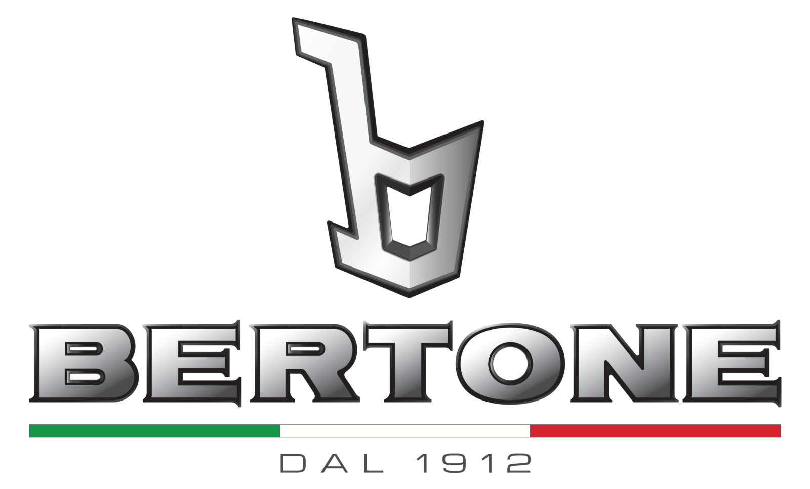
- As for the color palette, the gradient silver of the symbol and lettering got accompanied by a confident black outline, and the Italian flag colors were now present in the logo.
- The shapes and contours of both the iconic “B” and the inscription were refined and made more elegant.
- The black outline of the letters helped in it, elevating the look of each element.
- The logotype gained an underline — a thin horizontally stretched rectangle with green, white, and red fragments, celebrating the motherland of the brand, Italy.
- Font and color The Bertone logotype from the logo, introduced in 2010, was executed in a custom font with bold and confident shapes of the letters and sharp slightly elongated serifs on the ends of the lines, which were visible only due to the black outline.
- As for the Italian tricolor, green, white, and red, it was not only a tribute to the brand’s legacy but also a representation of the success, loyalty, and passion of Bertone.


Leave a Review