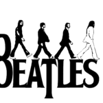
The Beatles logo and symbol, meaning, history, PNG
- After all, so many things iconic are often born from mere inspiration without any hard work.
- Meaning and history One fine spring day in 1963 Ringo Starr and Brian Epstein, the band’s manager, visited the Drum City store in London to find a new drum kit (it was to become Starr’s second kit).
- The owner of the store, Ivor Arbiter, was away, so the shop assistant called him to discuss the details.
- Symbol Probably the most unusual element in The Beatles logo is the letter “T”, which is bigger than it should and has a longer than usual vertical bar.
- Because of this, the logotype itself is often called the “drop-T” logo.
- Arbiter mentioned that he had emphasized the “T” with the purpose of making the word “beat” stand out.
- How did the “Drop-T” logo become the official emblem?
- Interestingly enough, the logo never appeared on any of the original UK albums’ covers.
- However, the emblem was so easy-to-recognize and unique that it was enough to make it the band’s main logo.
- The creator of the Beatles wordmark did not customize an existing font but created every character from scratch.
- The name of the band reads cleanly due to the big, solid letters.
- Color The only color featured in The Beatles logo is black.
- Classic and elegant, black in the world of color is very close to what The Beatles are in the world of music.
- Video


Leave a Review