evolution history and meaning
- Download PNG Bavaria Logo PNG Bavaria is the second largest brand of beer in Netherlands (after Heineken).
- Established in 1719, it’s now a part of Swinkels Family Brewers, a family business, selling such brands as Bavaria, La Trappe and Rodenbach.
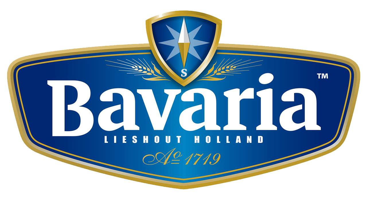
- Meaning and history The Bavaria logo is very bright and confident.
- The main brand color is blue, but the color palette of Bavaria also includes white for the wordmark and gold for the logo framing and the icon.
- Probably the choice of the color aimed against Bavaria’s main competitor – Heineken, and it’s green.
- Along with the wordmark, there is another element of the logo – a compass, pointing South, in a rounded-edge triangle.
- The compass is apparently a nod to the three Swinkels brothers that founded the brewery.
- The emblem is bold and consistent and it seems as if a whole custom typeface has been created around it.






Leave a Review