Bass Pro Shops logo and symbol, meaning, history, PNG
- Today the company has almost 200 stores across the country, and also successfully operates via its online platform.
- Meaning and history 1971 – 1972 The visual identity of the Bass Pro Shops brand hasn’t changed much since the day of the company’s foundation.
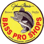
- The very first logo for Bass Pro Shops was created in 1971 and only stayed with the brand for a few months.
- Now the fish was set on the right of the oval frame, and all the lettering was placed inside the medallion, written in three levels with a delicate cursive tagline.
- 1977 – 1984 In 1977 the contours of the emblem were refined and emboldened, the tagline was removed from the badge, and the color palette tone from monochrome to burgundy in white.
- The logo started looking brighter and became more memorable and recognizable with the new shades.
- 1984 – 1998 The redesign of 1984 colored the Bass Pro Shops badge in bright yellow and red shades, and the company’s fish mascot — in green, with black, white, and red details.
- The lettering started looking more professional and elegant in the new scarlet-red shade, while the yellow background of the oval evoked a sense of energy and dynamics, reflecting the character of the brand and its values.
- 1998 – Today The Bass Pro Shops logo is composed of an oval yellow badge with a brown outline.
- In the middle of the oval, a red wordmark in three levels is set.
- The color palette of the logo was created in 1984.
- Before the emblem was executed in red contours and set on a white background, and the earliest version featured a monochrome palette.
- The lettering has a shadow, while the framing of the oval is rounded and gradient, which also adds volume and dynamics to the retailer’s visual identity.
- The wordmark is executed in a traditional italicized serif font and all the words are written in a title case, one under another.







Leave a Review