evolution history and meaning
- Download PNG Barney Logo PNG Barney is the kids’ tv-show character, created in the USA in 1992.
- The tv-show is extremely popular across the globe.
- Meaning and history 1988 – 1991 The very first logo for Barney was created in 1988 and became a prototype for all the following versions.
- 1991 – Today In 1991 the Barney logo was redesigned.
- It was a more “serious” and professional version of the original insignia, which is still used by the brand today.
- 1992 – 2003 In 1992 the logo from 1991 gets color and volume.
- The letters of the handwritten “Barney” logotype now feature a delightful yellow shade and a thin black outline.
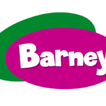
- 1996 – Today The Barney logo is composed of two overlapping ovals, which are executed in purple and green, the colors the Barney Dinosaur has in his costume.
- The wordmark is placed on the purple one.
- The free oval is located diagonally, more vertical, when the purple one is placed on it horizontally, making a perfect framing for the nameplate.
- The oval shapes of the logo evoke a positive and kind feeling, showing the friendliness of the famous Dino and his willingness to help.
- It looks like it is hand-drawn which only adds playfulness and friendliness to the logo.
- The Barney insignia is bright and happy, it is a good representation of the funny Dino hero.
- The white lettering adds a sense of purity and kindness, showing the good intentions and educational approach of the tv-show.


Leave a Review