Banana Republic Logo
- In most cases, the old Banana Republic logo looked elaborate to the point of being cluttered.
- The first name of the brand was “Banana Republic Travel & Safari Clothing Company.” 1983 – Today 1983 emblem The primary logo is basically just the name of the brand.
- The proportions of the glyphs are classic ones providing excellent legibility.
- We can also add that the glyphs are rather light.
- On the whole, the wordmark looks elegant and distinctive without losing its utilitarian purpose.
- Apparently, these characteristics of the logo are supposed to represent the brand’s approach to the style of the products it designs.
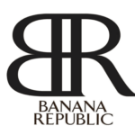
- In these cases, the company uses a compact icon.
- It features the letters “B” and “R” positioned in a slightly unusual way.
- There is in fact just the mirror reflection of the “B.” It is placed with its vertical bar next to the “R,” so the two glyphs form a single shape.
- This is a fresh approach that makes the icon memorable and distinctive.
- Due to it, the company stands out among its competitors using just the initials of the brand’s name as the icon.
- TFArrow-Medium is somewhat similar, at least some of the glyphs.
- Colors The palette consists of only two colors, white and black.
- This would be impossible in case of a colored emblem, especially in case the color is an unusual one.


Leave a Review