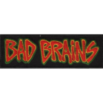
Bad Brains logo and symbol, meaning, history, PNG
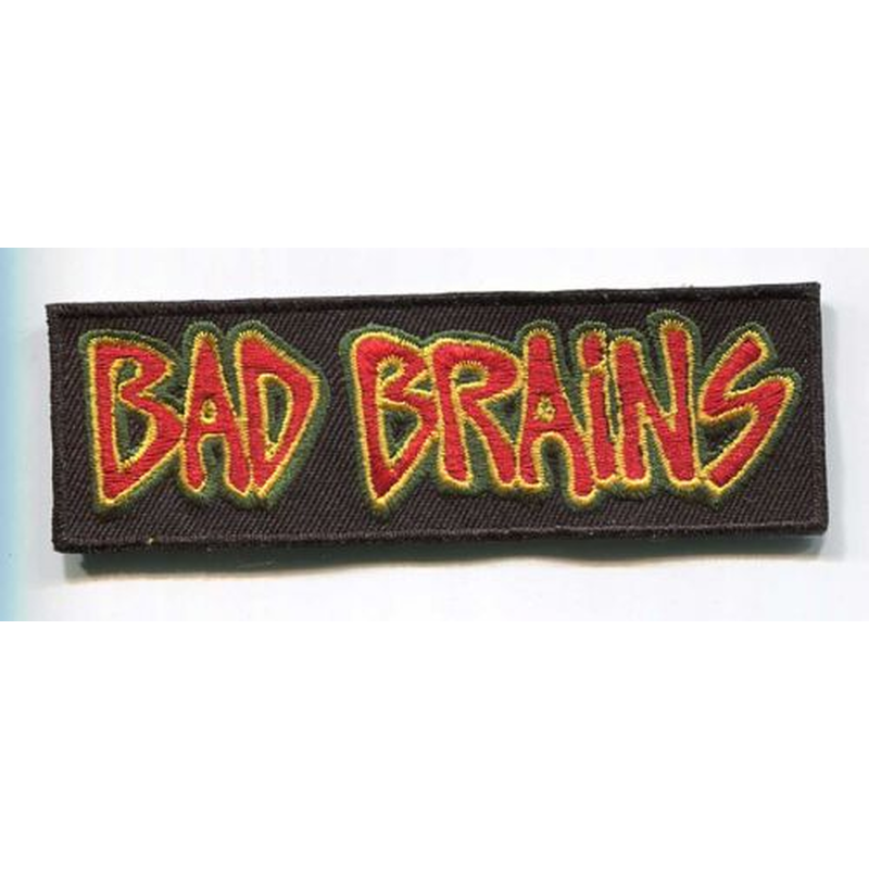
- Download PNG Bad Brains Logo PNG The rock band Bad Brains was created in Washington, D.C., US, in 1977.
- In other words, the logo has played a secondary part in comparison with the picture on which it was placed – it has been altered again and again to fit the visual context.
- This is a somewhat unusual approach.
- The idea of the cover belonged to ROIR label boss Neil S. Cooper.
- Rock for Light (1983) The wordmark is dramatically different.
- In both the previous album and this one, the wordmark appeared to have been written by hand.
- Yet, while the 1982 logo featured block letters, the 1983 version showcased glyphs connected like in cursive handwriting.
- What both the versions had in common was the casual, unpredictable, independent style.
- Yet, the shape of the glyphs is different.
- God of Love (1995) The wordmark has been redrawn, although it has preserved its casual style and the “squeezed” effect.
- I & I Survived (2002) The shape of the letters appears the same as on the album covers from 1986, 1989, and 1993.
- The complete overhaul of the wordmark was necessary to make it merge with the image where it was placed.
- Into the Future (2012) The one looks like no other Bad Brains logo.
- Although it features a cursive handwriting script, like some of its predecessors, the overall shape is different.





Leave a Review