Auburn Doubledays logo and symbol, meaning, history, PNG
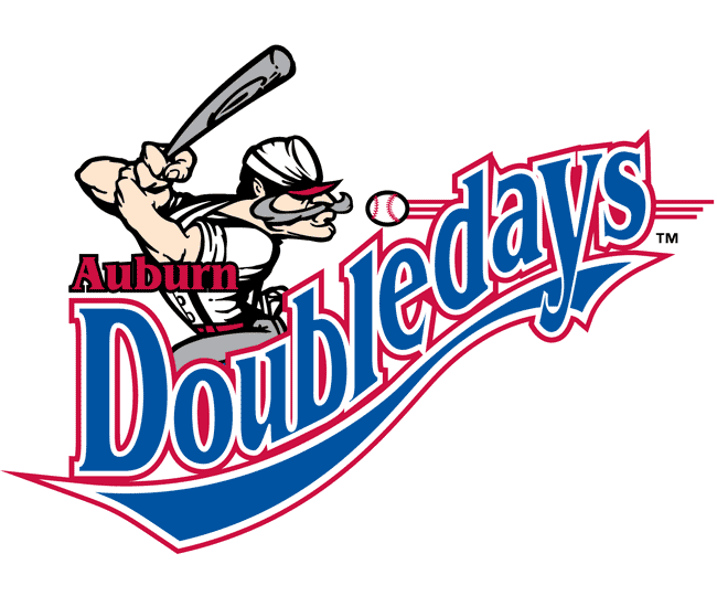
- Download PNG Auburn Doubledays Logo PNG Since 1996, the logo of the Auburn Doubledays has gone through only one subtle update, which aligned it with the parent team’s brand identity.
- Meaning and history The Auburn Doubledays adopted their current name upon moving to a new ballpark in 1996, while the history of the team in the New York–Penn League actually started in 1958.
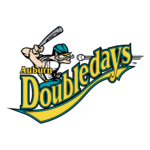
- Primary symbol The old Auburn Doubledays logo looked almost the same as the current one, except for the color scheme, which comprised an aqua or a teal and yellow.
- It featured the name of the team with a baseball player on the top.
- As the team became a Washington Nationals affiliate in 2011, it adopted a different color scheme, where navy blue was complemented by scarlet.
- Alternative emblem Although the main emblem has stayed the same apart from the colors since the 1990s, the franchise developed an additional logo in 2007.
- It features a large A “wearing” a Civil War cap and a mustache.
- Colors The current color scheme was inspired by that of the parent team’s logo.





Leave a Review