Atletico Madrid logo and symbol, meaning, history, PNG
- Download PNG Atletico Madrid Logo PNG The earliest Atletico Madrid logo was introduced during the club’s first season in 1903.
- The logo featured the same two colors, blue and white, as the team’s kits.
- It has been a really long and colorful way from the very first logo, designed in 1903, to the one we all know today.
- 1903 — 1911 The very first logo of the Atlético Madrid was completely different from all the following versions, both in shape and color palette.
- 1911 — 1917 The first redesign of the logo was made in 1911, and that is when the red and white palette replaced the blue one.
- Though this logo didn’t stay with the club for long, the striped pattern started being used on all the following versions of Atlético Madrid’s visual identity designs.
- Now it was a shield-shaped badge with a vertical striped red and white pattern and a triangular segment on the upper left corner.
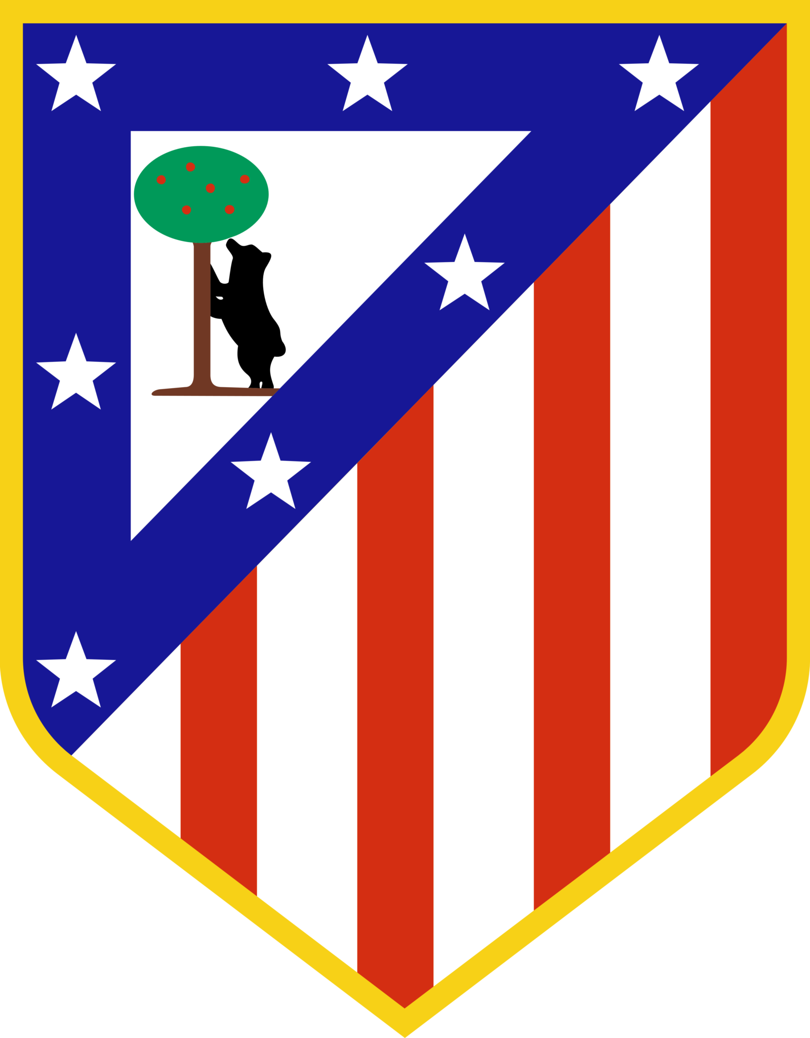
- Inside the green triangle, framed in blue with seven white stars, there was a bear standing under the tree.
- In some versions, the emblem was outlined in gold and had a slightly pointed bottom part.
- 1939 — 1942 The new visual identity era started for Atlético Madrid in 1939 when the team merged with the National Aviation team after the civil war in Spain.
- So the new badge depicted the Atletico’s iconic shield, which the blue triangle replaced with red, and its green background simplified to white, placed on a winged gray badge.
- 1942 — 1947 In 1942 the blue triangular outline came back to the logo, and the number of vertical stripes was back to four red and four white ones.
- The color palette was simplified to blue, white, and red, the contours of the shield became a cleaner and smoother, and the upper side — slightly arched.
- The main change was done to the “bear and the tree” part.
- There’s the iconic bear under the apple tree, the white stars on the dark blue background, as well as the red and white stripes that can also be seen on the current shield.
- Current emblem In 1939-1947, the club went through three winged logotypes, and then the era of the bear-under-and—the-apple-tree shields started, once again.
- And yet, there’s another point that probably wasn’t considered by most of the fans as they are far from the world of design.
- While you could discern them on the old Atletico Madrid logo 512×512, smaller sizes were a challenge.
- Color The current Atletico Madrid logo combines three colors: red (hex: #CB3524) and navy blue (hex: #272E61) for the picture and white for the background.
- The color palette of the previous logos was more complex (it consisted of some six or seven colors) and, therefore, more difficult to reproduce.


Leave a Review