Atlanta Gladiators logo and symbol, meaning, history, PNG
- Download PNG Atlanta Gladiators Logo PNG The franchise that is now known as the Atlanta Gladiators (Duluth, Georgia) was set up as the Mobile Mysticks in 1995.
- From 2003 to 2015 this ice hockey team bore the name of the Gwinnett Gladiators.
- In 2015, a few years after their relocation to the Atlanta metropolitan area a decision was taken to add the word “Atlanta” to their name.
- Meaning and history 2003 — 2015 The name “Gladiators” submitted during the contest “Name the Team” in 2003 was recognized as the best one.
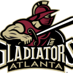
- As a result of the renaming, the new logo was the image of a gladiator in gold and garnet.
- The gladiator is wearing a typical gladiator outfit including a gladiator helmet with face armor.
- In his right hand he is holding a sword and in his left hand there is a shield.
- The stylized wordmark “Gladiators Gwinnett” goes across the bottom.
- The white with gold fringing “Gladiators” and the gold “Gwinnett” are against a black background.
- Such a logo added more energy to the team’s identity.
- 2015 — 2019 As part of the name change in 2015 the team updated their logo by replacing the word “Gwinnett” with the word “Atlanta”.
- The rest of the logo remained unchanged, as well as their colors ‒ black, garnet, gold and white.
- 2019 — Today The redesign of 2019 changed the color palette of the Gladiators logo are refined the lettering under the graphical part.
- As for the wordmark, it is set in a white background and executed in all capitals of a smooth and bold serif typeface, with the “Atlanta” tagline in sans-serif uppercase.


Leave a Review