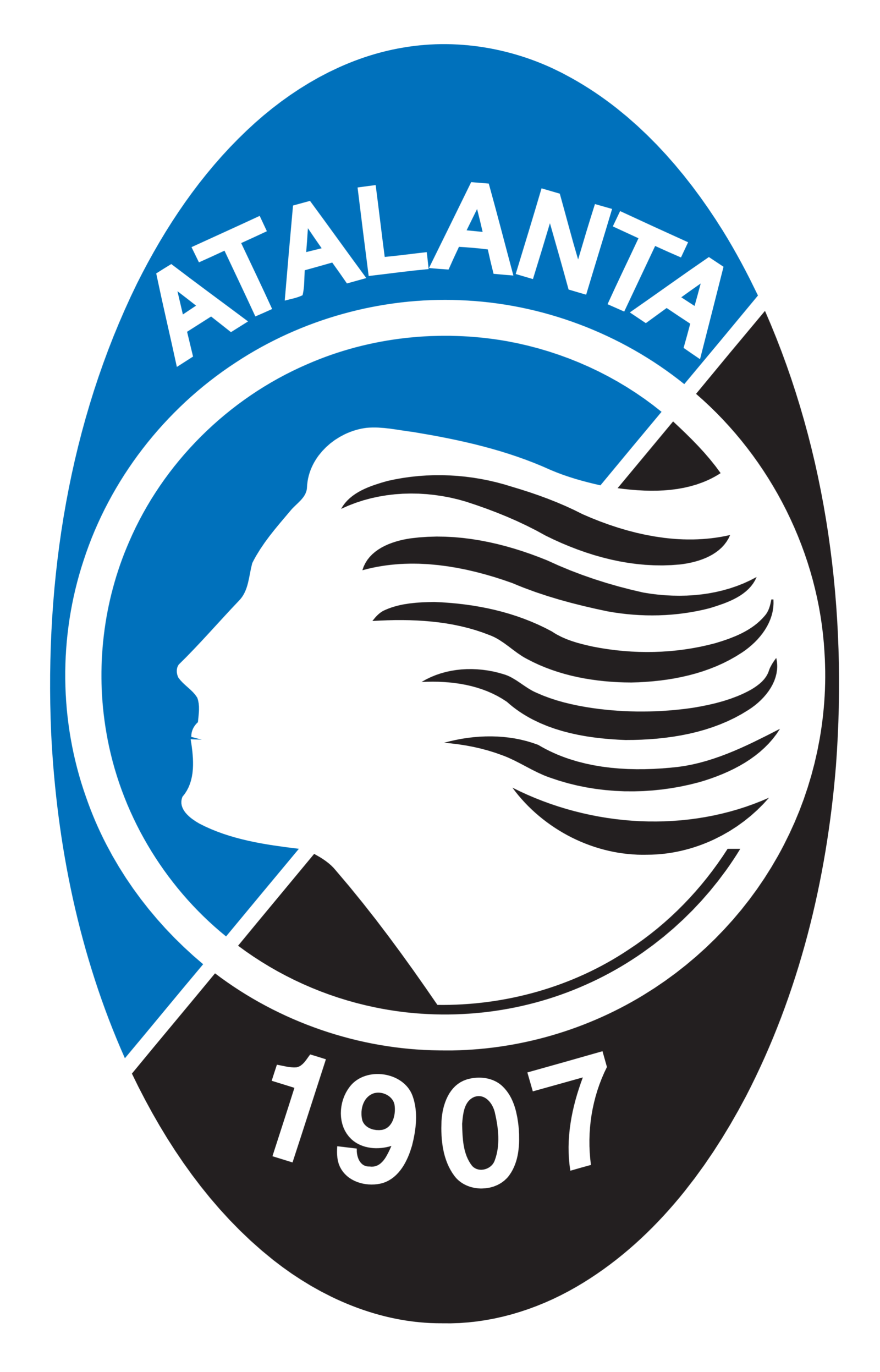
Atalanta logo and symbol, meaning, history, PNG
- Download PNG Atalanta Logo PNG During its more than 110-year history, Italian football team Atalanta Bergamasca Calcio has gone through a series of logos.
- Although they have looked very different from one another, we can still notice a recurrent motif – the black stripes, which can be also seen on the club’s uniforms.
- In the earliest Atalanta logo, the black stripes were placed on the white background inside a shield shade.
- Next to the black stripes, there was a dark blue field, while the club’s name could be seen on the top.
- 1963 – 1970s In the course of time, the club decided to opt for a logo featuring a running girl.
- It was inspired by the Greek myth of Atalanta, a virgin huntress, unwilling to marry anyone who couldn’t outrun her in a footrace.
- 1970s – 1984 The Atalanta logo, designed in the 1970s, featured a fancy yet simple crest with white as the main color and a thick black outline.
- The crest was vertically divided into two equal parts, the right one featured a blue and white striped pattern, while the right one in white had a stylized black contoured image of a woman on it.
- 1984 – 1993 The redesign of 1984 introduced a new badge for the team.
- The only element of the badge was a stylized portrait of a woman, placed in profile, facing left, and having her black hair waving to the right.
- 1993 – Today The logo Atalanta adopted in 1993 also featured the legendary virgin runner.
- Colors The three colors comprising the 1993 logo – blue, black, and white – have been used since the club started its history at the beginning of the previous century.
- However, the shade of blue hasn’t been the same.
- The original blue was dark, the 1960s logo featured a lighter and warmer shade, while the current emblem sports a bright shade of azure blue.


Leave a Review