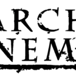
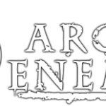
Arch Enemy logo and symbol, meaning, history, PNG
- It has been exceptionally consistent in its visual brand identity – the Arch Enemy logo has looked almost the same over the band’s more than 25-year history.
- Meaning and history The two parts of the logo, the wordmark and the symbol, have been typically used independently.
- Stigmata (1998) The second studio album already features the combination of the characteristic serif type and the circular emblem.
- At first glance, the type may seem quite generic.
- Yet, if you take a closer look, you will notice several distinctive features, including the angle at while the serifs on the “C” and “E’s” are placed, the shape of the diagonal bar of the “R,” the varying widths of the strokes, etc.
- The symbol, which is positioned to the right of the wordmark, consists of a small circle placed inside a larger circle (not unlike a bullseye).
- There have been quite a few interpretations of the symbol.
- We can mention the most obvious one (the eye), which can be supported by the fact that the symbol is often placed next to a face without the eye.
- The “thorns” resemble the eyelashes.
- Another interpretation is that it’s a modified symbol of Anarchy.
- Even the name of the band is made up of almost all the same letters as the word “anarchy,” which only supports this interpretation.
- The central circle resembles a planet.
- War Eternal (2014) The pictorial part of the Arch Enemy logo has been moved to the background.
- Will to Power (2017) The roundel is almost lost among the multiple details.


Leave a Review