evolution history and meaning, PNG
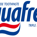
- Download PNG Aquafresh Logo PNG The number of the updates the Aquafresh logo has gone through during its almost 50-year history has reached at least eight.
- Meaning and history 1973 You can already see the italicized word “Aquafresh” and the toothpaste above.
- 1986 The name of the brand, which is given in a narrower type, is now blue.
- The toothpaste above is smaller.
- 1989 The blue is replaced by teal, the toothpaste moves below the wordmark and is now colored in three colors.
- 1992 The color grows brighter, the toothpaste disappears.
- 1998 The letters are sloped a little more, the blue looks a bit lighter.
- 2012 The toothpaste now dominates the design.






Leave a Review