Animal Crossing logo and symbol, meaning, history, PNG
- Animal Crossing Logo PNG Animal Crossing is a social simulation video game series created by Japanese video game designers Katsuya Eguchi and Hisashi Nogami for Nintendo.
- Here, the player is a human who comes to a village where all sorts of anthropomorphized animals live.
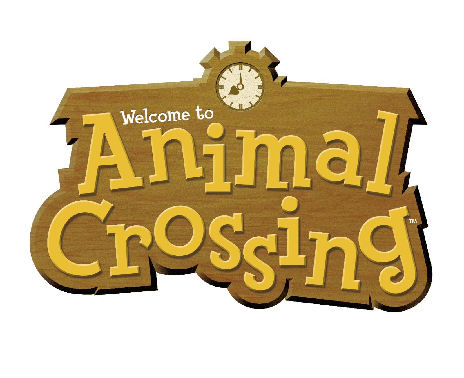
- In addition to the original release, the series also includes the following versions: – Wild World (2005) – City Folk (2008) – New Leaf (2012) – Plaza (2013) – Happy Home Designer (2015) – Amiibo Festival (2015) – Pocket Camp (2017) – New Horizons (2020) 2002 The Animal Crossing logo showcases the name of the series “written” on something looking like a wooden board.
- The lettering “welcome to” only reinforces this impression.
- The authors of the logo have tried to make it inviting and friendly and to make you want to “enter” this door.
- The serifs are somewhat irregular – they do not look like something that has been created with the use of the computer but rather something made with one’s own hands.
- The clock, which of course isn’t a digital one, perfectly merges with the “home” feel.
- 2019 (New Horizons) The logo was developed for Animal Crossing: the New Horizons for Nintendo Switch.
- It looks pretty much the same, with only tiny tweaks.
- Most likely, the majority of viewers haven’t even noticed any alterations – they are visible only if you compare the two versions side-by-side.
- In this case, you may notice that the design has grown more vivid and more dimensional.
- Another important modification has taken place in the way the letters are drawn.
- The letters look as if they have been carved on a wooden board.
- Japanese version (since 2015) On the one hand, the writing looks different due to the change in the language.


Leave a Review