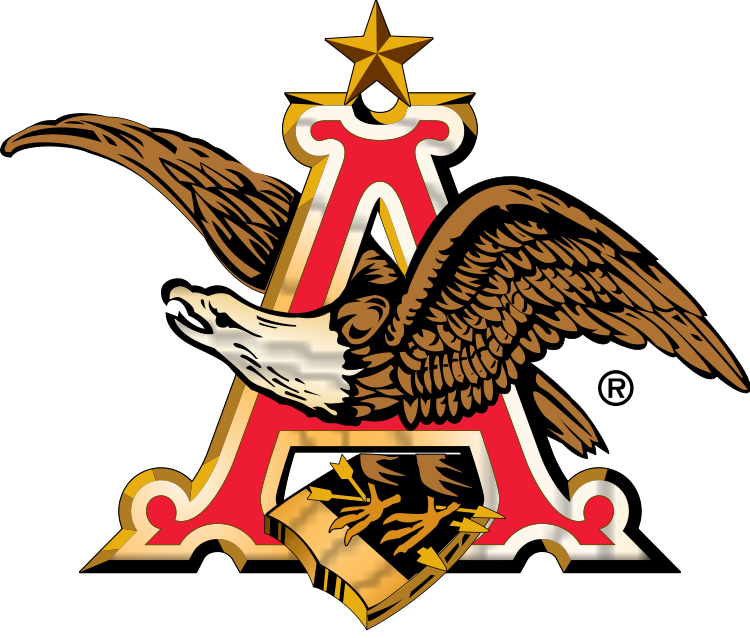
Anheuser-Busch logo and symbol, meaning, history, PNG
- Download PNG Anheuser-Busch Logo PNG Anheuser-Busch is the name of one of the world’s most famous breweries, established in 1852 in the United States.
- The company has its subsidiaries across the globe and distributes its beverages on all the six continents.
- Meaning and history The Anheuser-Busch visual identity is ornate and instantly recognizable.
- The Anheuser-Busch logo is composed of the letter “A” in red and gold and an eagle, flying through it.
- The “A” has curves on its serif and looks really royal and luxurious.
- The eagle is a reflection of courage and power, while the arrows pointing right represent the company’s innovative and progressive approach, as well as its willingness to move forward and its confidence in today.
- The prevailing color of the Anheuser-Busch logo is gold, which symbolizes love, wisdom, and passion.
- This is how the brand treats its customers and how it leads its business.


Leave a Review