Anaheim Ducks logo and symbol, meaning, history, PNG
- Meaning and history The history of the Anaheim Ducks hockey club visual identity is pretty short — the team’s logo has undergone only three redesigns, where actually just the first one gave a style and direction for two following ones, and the very first logo of the club was introduced when it was named Mighty Ducks of Anaheim, so the first redesign was meant to celebrate the new name and new era, and it worked just fine.
- 1993 — 2006 The Mighty Ducks of Anaheim logo, introduced in 1993, is actually one of the most recognizable jockey insignias in the world, due to its bright color palette and interesting design idea, where the white duck head was stylized as a protection pattern of the hockey helm.
- This logo stayed with the team for more than a decade and is still remembered by the club’s fans.
- 2006 — 2010 The name of the club was changed to Anaheim Ducks in 2006, and the logo was redesigned in the same year.
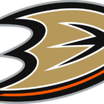
- The new minimalist concept was composed of a stylized gold inscription with an orange and black outline.
- The first letter of the wordmark, “D”, was drawn as the duck’s palmate, having its left border pointed and sharp.
- The “Anaheim” part of the nameplate was set above the bold golden inscription in a modern and square sans-serif typeface using only black lines.
- 2010 — 2013 The redesign of 2010 was more about the switch of the color palette, as all the elements of the logo remained untouched, just the intense golden-yellow shade got replaced by a muted, more beige tone of gold, which gave a sense of seriousness and professionalism to the whole image, elevating it and adding some luxury to the club’s visual identity.
- Along with this primary version of the logo, the team still uses the iconic duck emblem from the 1990s for their uniform.
- Font The current emblem features only one letter, “D”, which does not actually look like a “D”.
- The previous version was built around a very unusual custom all-cap font.
- Color The club’s official color palette comprises black, metallic gold, orange, silver, and white.
- All the five colors can be seen in the Anaheim Ducks logo.
- Anaheim Ducks Colors ORANGE PANTONE: PMS 1655 C HEX COLOR: #F47A38; RGB: (252, 76, 2) CMYK: (0, 69, 100, 0) METALLIC GOLD PANTONE: PMS 465 C HEX COLOR: #B9975B; RGB: (185, 151, 91) CMYK: (9, 29, 66, 24) SILVER PANTONE: PMS 428 C HEX COLOR: #C1C6C8; RGB: (193, 198, 200) CMYK: (10, 4, 4, 14) BLACK PANTONE: PMS BLACK 6 C HEX COLOR: #000; RGB: (0, 0, 0) CMYK: (0, 0, 0, 100)










Leave a Review