American Eagle Logo
- Download PNG American Eagle Logo PNG The first shops of the American Eagle Outfitters opened in 1977.
- The original American Eagle logo was pretty intricate and cluttered.
- It was dominated by the lettering, while the eagle looked small and overshadowed.
- Meaning and history 1977 The majority of the first logo was occupied by the words “American Eagle” in an artistic serif type.
- The glyphs were bold and pretty heavy.
- The line below “American Eagle” formed a hill, so the size of the writing was modified to fit the hill (the letters on the top were smaller).
- Behind the eagle’s wing, there was a circle representing the sun.
- Below the eagle, the lettering “Outfitters” could be seen in a script with fancy swirls.
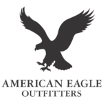
- It looks different than in the previous version.
- The full name of the brand in a simpler all-caps serif type can be seen below.
- It is given in two lines.
- You can clearly see the difference between the older version and the newer one in the way the “E” glyph looks, for instance.
- In the Newburgh type, they have the same lengths.
- Icon In addition to the primary logo, the company also has a favicon, which is used when a compact version of the logo is required.


Leave a Review