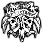
Alice in Chains logo and symbol, meaning, history, PNG
- Download PNG Alice in Chains Logo PNG Alice in Chains (also known as AIC) is a US rock band based in Seattle, Washington.
- It was started in 1987 by Jerry Cantrell and Sean Kinney.
- “Writing on the wall” wordmark This is probably the best-known visual interpretation of the band’s name.
- manner.
- The glyphs look as if they had been literally written on the wall by hand.
- While the basic version of this wordmark is red on the white background (to allude to the color of the blood), you can also come across various other color schemes.
- For instance, on the cover of the Facelift album (1990), the lettering is white, to create enough contrast with the pretty cluttered background.
- The wordmark on the cover of the second album, Dirt (1992), showcases an orange and black gradient.
- “Wave” wordmark Here, each of the letters in the name of the band is positioned at a different height, which creates an illusion of a wave (or that you see the writing through the water).
- We should add that in the “Writing on the wall” logo, there is also a slight “wave” effect, although it is not as prominent.
- Sun logo Unlike the logos described above, this is not just the wordmark but a detailed image with plenty of additional symbols.
- The centerpiece of the Alice in Chains logo is a circle with plenty of rays symbolizing the sun.
- In the middle, you can see the letters “AIC” (the abbreviated name of the band).
- The background is orange, yellow, and black.


Leave a Review