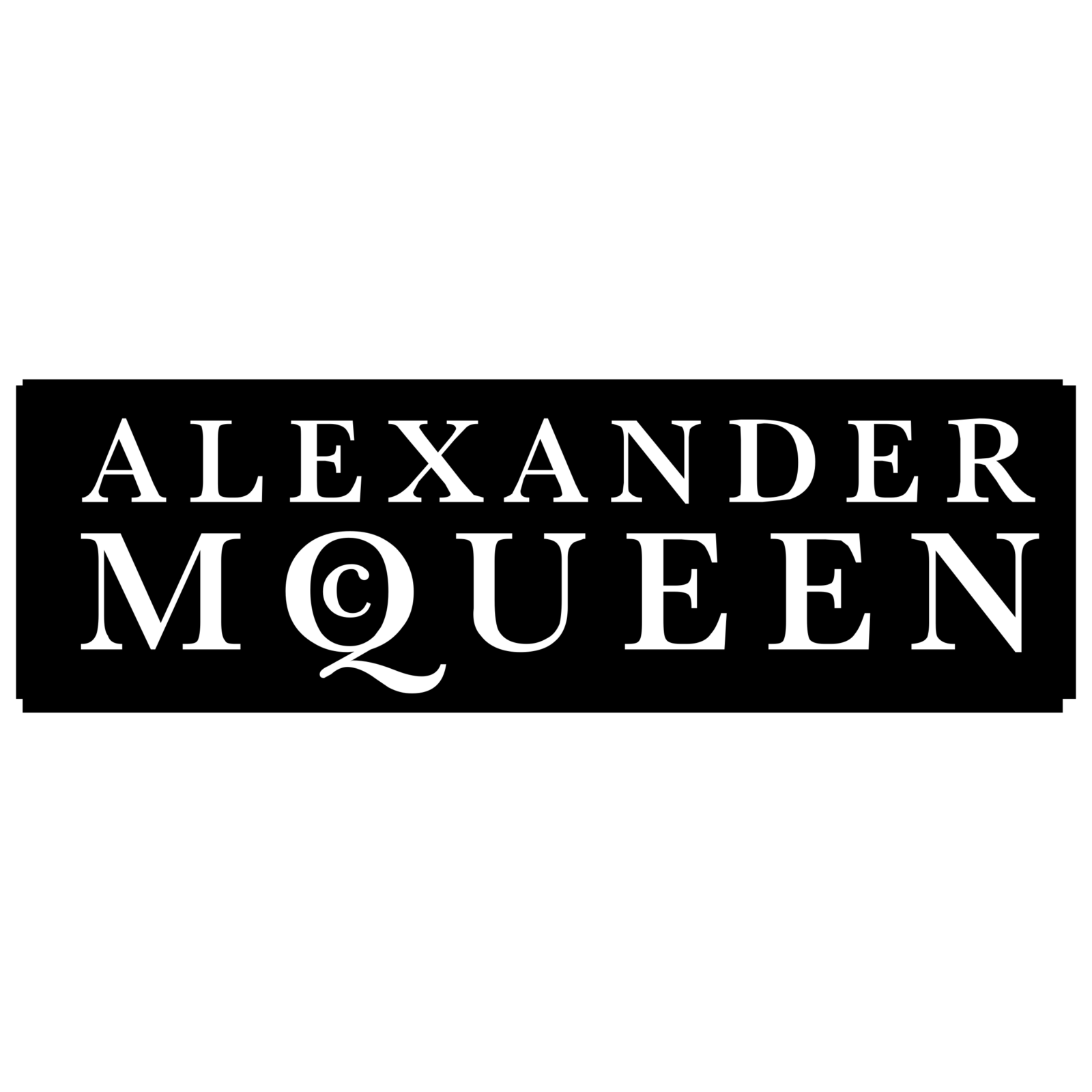
Alexander McQueen logo and symbol, meaning, history, PNG
- The brand’s logotype is based on the wordmark.
- Meaning and history The history of the brand started in 1992.
- Alexander McQueen’s early collections were notorious for their shock tactics.
- Many items verged on indecency.
- For instance, the designer introduced trousers cut so low that they were immediately nicknamed bumsters.
- According to a fashion commentator, there were only a dozen or two of people in England wearing such trousers at the time.
- His following collection, which was officially called Highland Rape, only reinforced his reputation as “the hooligan of English fashion.” When in late 2000 the Gucci Group purchased 51% of the brand, Alexander McQueen went on playing a major part in it, now at the post of Creative Director.
- While the range itself was launched in 2006, its current logo was introduced in 2015.
- It features a large letter “Q” with smaller “M” and “C” inside.
- So, it looks a lot like the “Q” from the primary logo, with a minor difference.
- Font As we’ve already mentioned above, the serif typeface featured on the logo has classic proportions and doesn’t stand out.
- Colors The combination of black and white seems to be the most widely used color scheme in the universe of fashion logos.
- In this respect, the Alexander McQueen logo doesn’t go any further than this popular choice.
- The reason seems pretty obvious, as this option allows maximum flexibility when placing a logo on clothes of different colors – black looks appropriate on almost any background.


Leave a Review