Ajax logo and symbol, meaning, history, PNG
- Download PNG AJAX Logo PNG AFC Ajax (Amsterdamsche Football Club Ajax) has been around since 1900, and now it is among the most successful football clubs in the world.
- Since its inception it has won numerous titles.
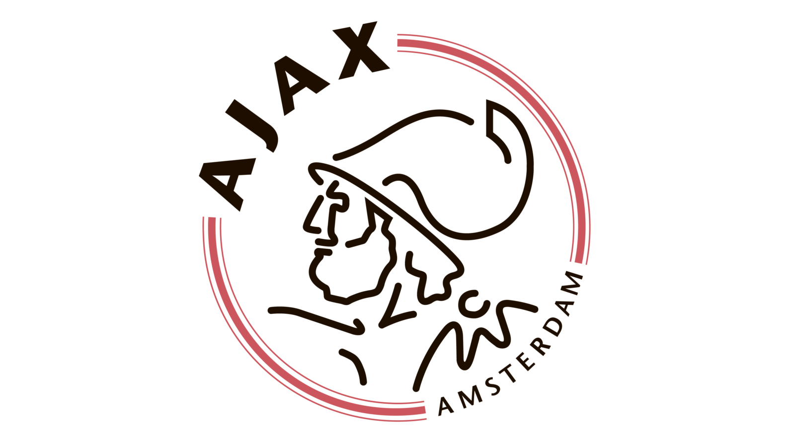
- Meaning and history The visual identity of Ajax, one of the most successful clubs in the history of European football, has always been very consistent: the portrait of one of the Greek mythology heroes, Ajax, has been with the club since the middle of the 1920s.
- The original logo, designed for Ajax in 1900 depicted the club’s player on a rounded badge, enclosed into a thick red frame with white lettering on it.
- The player was wearing a white uniform with a wide red vertical stripe of the jersey.
- The wordmark was placed around the perimeter of the emblem, on its red part, and was composed of “Amst.
- Football Club Ajax” lettering in all capitals.
- 1911 — 1928 The logo was first redesigned in 1911 after the uniform of the team was slightly changed.
- Another thing that was changed was a wordmark.
- As for the horizontal separating lines, they gained delicate white dots between each other.
- 1928 — 1991 The portrait first appeared in the Ajax logo in 1928.
- The “Ajax” inscription in all capitals was placed on the left of the portrait, around the emblem’s perimeter.
- On the right side from the hero’s profile, there was a small and delicate white and red crest placed, in order to celebrate the football club’s background and history.
- The wordmark of the club’s emblem was executed in an extended sans-serif typeface and made three-dimensional by using a gradient black and gray.
- The inscription featured a modern and bold sans-serif typeface and is written in black, being clean, and stylish.
- Another change in the team’s visual identity is the addition of the “Amsterdam” inscription to the logo.
- It is placed opposite of the main wordmark, executed in small size capitals.
- The Ajax logo in black, red, and white is minimalist and abstract, yet shows the club’s connection with its roots and its value of the history and heritage.
- Shape and colors The new logo design is based on the previous one.
- The red color stands for energy and passion, while the black color emphasizes perfection, strength, and elegance.


Leave a Review