Air Berlin Logo
- Download PNG Air Berlin Logo PNG Meaning and history 1978 – 1986 The original Air Berlin logo (1978-1986) featured a dynamic triangular shape paired with the lettering “Air Berlin USA” and the “AB” monogram.
- 1986 – 2008 The design undergoes a complete overhaul.
- Although the shape on the left references the original boomerang, it is now much softer.
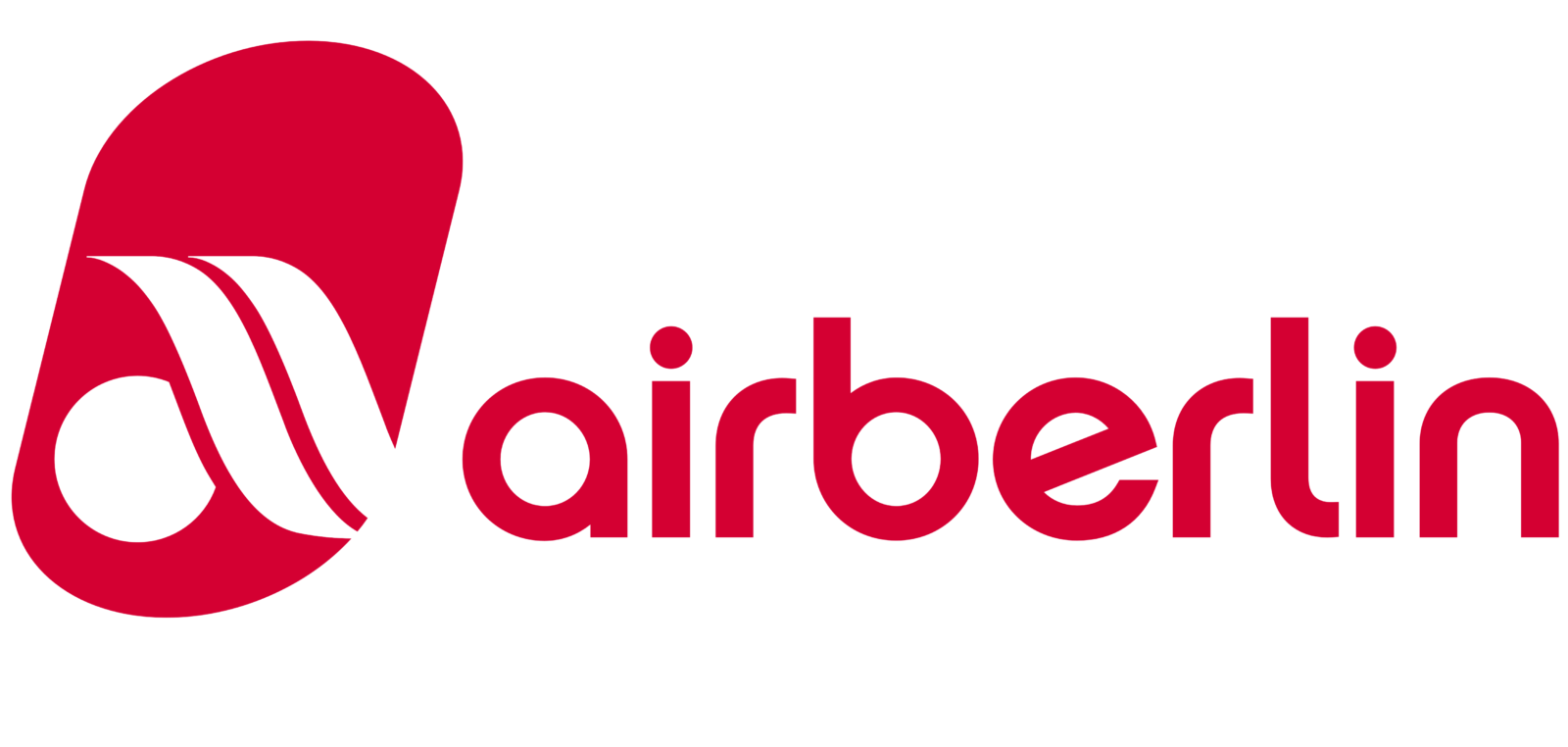
- 2008 – 2017 The boomerang grows even softer and becomes part of a stylized “a.” The letter is placed inside a red ellipsoid.
- The shade of red has grown brighter than in the 1986 design, while the lettering “Genau deine Airline” has appeared.
- Font and color The lowercase Air Berlin inscription, placed on the right from the lightweight and modern emblem of the company, is executed in a contemporary Sans-serif typeface where the rounded letters feature thin and clean lines, softened angles, and traditional cuts.
- The red and white color palette of the Air Berlin visual identity reflects the reliability and confidence of the company, along with its professional and fundamental approach to providing the best services to their customers and making their traveling experience comfortable and safe.
- Video




Leave a Review