Aer Lingus Logo
- Download PNG Aer Lingus Logo PNG Aer Lingus is one of the main Irish airlines, which was established in 1936.
- Today the label is owned by International Airlines Group, which is considered to be one of the most reputable and popular corporations in the European airlines’ segment.
- Meaning and history The visual identity of one of the most well-known and reliable Irish air carriers, Aer Lingus, has a very intense and colorful history, which includes seven redesigns of the logo and numerous experiments with the style of its wordmark.
- The blue and white color palette of the logotype made it look professional and bright.
- 1945 – 1947 The blue and white color palette was kept with the complete change of style in 1945.
- The new logotype was written in white capitals of an italicized sans-serif typeface with narrowed shapes, and placed on an intense blue background.
- It was an elegant and bright badge, which only stayed with the company for a couple of years.
- The new visual identity of Aer Lingus was based on a dark red and white color scheme, where the capitalized logotype was written in a typewriter-style font with bold and confident lines and elongated serifs.
- The wordmark in two levels was executed in two shades of green, with the “Aer Lingus” in dark, repeating the shade of the square, and the “Irish” in a lighter tone, the same as in the shamrock leaf.
- 1996 – 2019 The redesign of 1996 brought the logo version, which became a basis for the badge we all can see today.
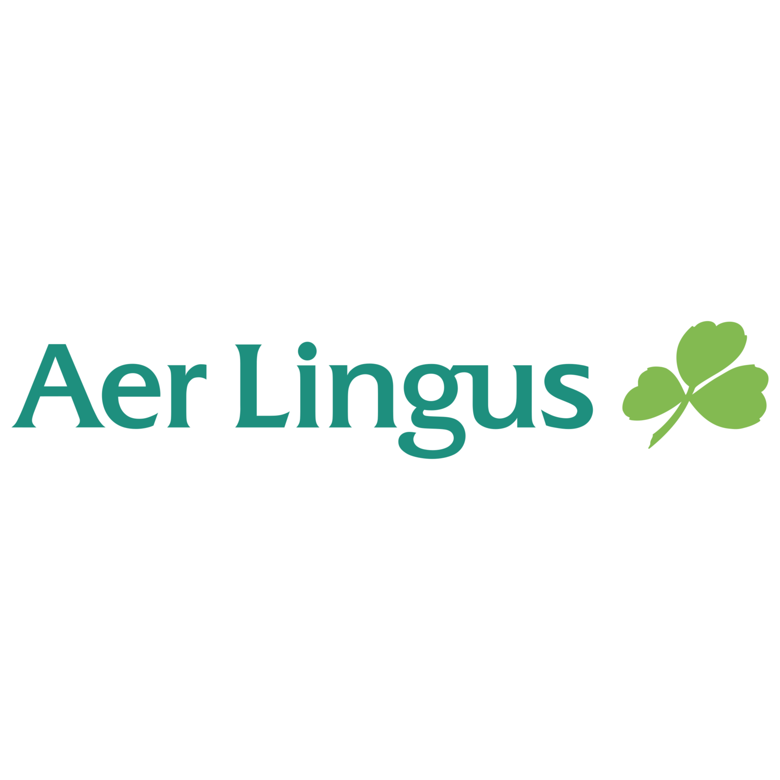
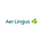
- The sea-green logotype in the title-case was placed on a white background and had a green shamrock on its right.
- As for the emblem, it’s contouring we’re refined and cleaned and now looks light and fresh.
- Font and color The Aer Lingus logotype, which is usually placed on the left from the emblem, is written in a title case of a modern yet elegant sans-serif typeface, where wide and neat letters feature their lines smooth and bold.
- Video




Leave a Review