Advance Auto Parts logo and symbol, meaning, history, PNG
- Today the company has almost 5 thousand locations across the United States and Canada and has a pretty good reputation on the market.
- First of all, the color palette was switched to red and black on white.
- Secondly, the lettering was now set in two levels on a plain white background.
- The wordmark of the new logo was set in the title case of an italicized sans-serif font with extended contours of the letters.
- 1991 – 1999 In 1991 the logo of the company gets redesigned again.
- The style of the lettering remained almost untouched, just the letters became a bit taller, and changed their color to all-black.
- The triangles were replaced by a black vertically oriented parallelogram, and the white background gained a thin diagonally striped pattern in black and white.
- 1999 – 2002 The redesign of 1999 brought back the red color and the plain white background to the Advance Auto apart visual identity.
- As for the logotype, it remained untouched, and the stripes from the background were removed.
- The original logo was composed of an italicized wordmark, set in two levels with a delicate and elegant tagline, and a red parallelogram on the right.
- The tagline “The Best Part Is Our People” was written in a traditional serif font with smooth and thick lines, while the main wordmark used a soft custom sans-serif.
- All the lettering featured black color and was placed on a white background, which sometimes gained a striped monochrome pattern, depending on the placement.
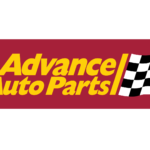
- The black, white and red color palette was switched to yellow and red with a monochrome checkered flag in 2002.
- The italicized inscription represents speed and energy, while the flag refreshes the logo, adding strictness and solidness, and elevating the automobile associations of the visual identity to the new level.


Leave a Review