Adobe Flash Logo logo and symbol, meaning, history, PNG
- Download PNG Adobe Flash Logo PNG Adobe Flash is a software, developed in 1996 by FutureWave Macromedia.
- The player enables us to run graphics in SWF format, as well as video and audio files.
- The program can be a part of the web browser or installed on its own.
- It was a bright blue badge with lots of lettering in different styles and colors on it.
- It was a colorful abstract image of two overlapping compact discs in gradient blue, green-yellow, and orange, with a circular white “loading” sign composed of several smooth bars.
- 2002 – 2005 The redesign of 2002 introduced a modern and strict badge in the red and gray color palette.
- 2005 – 2007 In 2005 the logo was refined again, and now the red “F” was placed on the left from the “Macromedia Flash” executed in the same style as on the previous version and set in two levels and was accompanied by an enlarged “Professional” in thin lines of a sans-serif typeface, written in light gray and complemented by a bold red digit “8”, standing for the new version of the software.
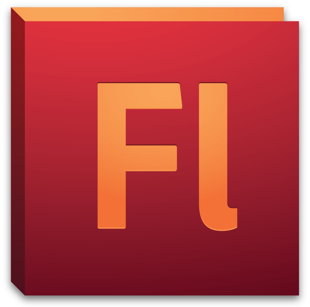
- The gradient burgundy square had a white “Fl” lettering on it.
- The abbreviation was executed in a smooth and bold custom sans-serif typeface with the upper horizontal bar of the “F” cut slightly diagonally.
- This time the square background was colored in gradient red, which became darker to the bottom, and the white lettering was replaced by the black one, with wider contours.
- The color palette now looked the following way: the gradient red square with orange elements and the gradient orange tone of the letters, which were still written in the custom sans-serif with smooth modern lines.
- 2012 – 2013 The redesign of 2012 simplified the shape of the Adobe Flash logo, making it flat again.
- This time the main color of the square background was black, but it gained a thick red framing, which balanced the lettering, executed in the same color with the same thickness of the lines.
- The color palette was also changed and the intense red from the previous version got replaced by a dark orange, which looked dynamic and powerful a the thin orange square frame made it possible for the logo to be placed on any background, staying visible and recognizable.
- 2015 – 2016 In 2015 the contours of the Adobe Flash logo elements were emboldened and cleaned and the shade of orange became a bit more intense and dark.
- 2016 – 2020 In 2016 the “FL” lettering was replaced by “An” and the typeface was changed to a bolder and smoother one.
- As for the color palette, it remained the same, as well as the thin square frame.
- 2020 – Today The redesign of 2020 completely changed the style of the Adobe Flash logo.
- Now it is a dark blue square icon with rounded angles and no framing.
- The “An” lettering on the icon is drawn in a light purple shade and features a new custom font with thick lines and interesting elongated tops of the vertical bars.





Leave a Review