A Day to Remember logo and symbol, meaning, history, PNG
- They are best known for the unique combination of metalcore and pop-punk.
- Meaning and history The band was formed in 2003 by Tom Denney and Bobby Scruggs.
- As of 2020, there are five members, none of them are the original members.
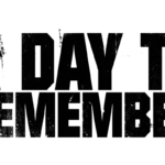
- Alternatively, you could interpret it as a wall with multiple cracks.
- In other words, the lettering was placed onto a surface that was being ruined.
- Such a style perfectly fit the image on the album cover depicting a house on fire, with prominent cracks on the columns.
- The same “cracked” logo was used on the covers of their second studio album, For Those Who Have Heart (2007), again paired with a man holding a baseball club.
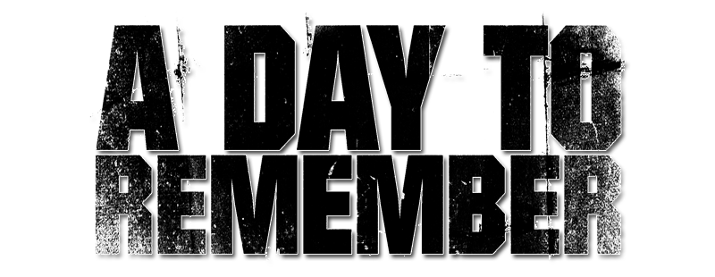
- 2008 — Today The third studio album, Homesick, which was released in 2009, showcased a heavier ADTR logo.
- Similar to the “cracked” logo, this one also featured the name of the band broken down into two lines.
- Nevertheless, this was a drastically different design.
- While the surface behind the letters was “damaged,” you could also see something that looked like drops of white spray paint on the letters.
- So, you could suggest that the building “ruined” in the debut album was being renovated.
- And again, the A Day to Remember logo perfectly fitted the name of the album, which implied that someone wanted to get back to the things he had abandoned.
- The shape of the letters echoed the appearance of the monster depicted next to the wordmark.





Leave a Review