A.C. Milan logo and symbol, meaning, history, PNG
- Meaning and history The visual identity of the celebrated European football club has always been based on the Red Cross, positioned on a white background.
- It is the iconic St.George’s Cross, or St.Ambrose Cross (in Italy), which is also an essential part of their mother-city flag.
- 1899 — 1916 The very first badge of the team was a smooth square, vertically divided into two parts, with a Red Cross on the right and vertical black and red stripes on the left.
- 1920 — 1937 In 1929 the circle with stripes and cross was placed inside an oval with “MFC” lettering on the top and “1899” inscription in its bottom part.
- The white, red and black circle gained a clean and thick red outline, which made it look brighter and more confident.
- 1946 — 1961 The version of 1946 had a laurel wreath around a white oval, where the iconic circle was located.
- 1961 — 1964 The Red Devil appeared on the A.C. Milan logo in the 1960s.
- Now it was seated on the white oval, which was located on a flag with black and red vertical stripes.
- 1964 — 1967 The oval was removed from the logo in 1964 and the flag’s shape was changed to a shield.
- The “Milan” inscription was written in black and placed on a white rectangle on the top of the shield.
- 1967 — 1968 The version of 1967 featured the red devil on a white shield, which was placed on a square with a black and red background.
- Now the Red Cross was placed on a white shield, which was located on the upper right side of a red and black square.
- 1973 — 1974 The version of 1973 boasts a white circle rested on striped background with the “Milan” lettering in capitals written in white inside a black rectangle in the top of the shield.
- The circle with stripes and cross is placed inside an oval with “ACM” wordmark on top and “1899” under the circle.
- Enclosed in a yellow and black frame, it was instantly recognizable and bright.
- 1987 — 1995 In 1987 the club decides to come back to the roots and redesigns the logo again.
- The circle with red and black stripes on the left and a Red Cross on a white background on the right is placed inside an oval with a yellow outline.
- 1995 — 1996 The word “Milan” is replaced by “ACM” and the yellow color is changed to black, which adds power and confidence to the logo.
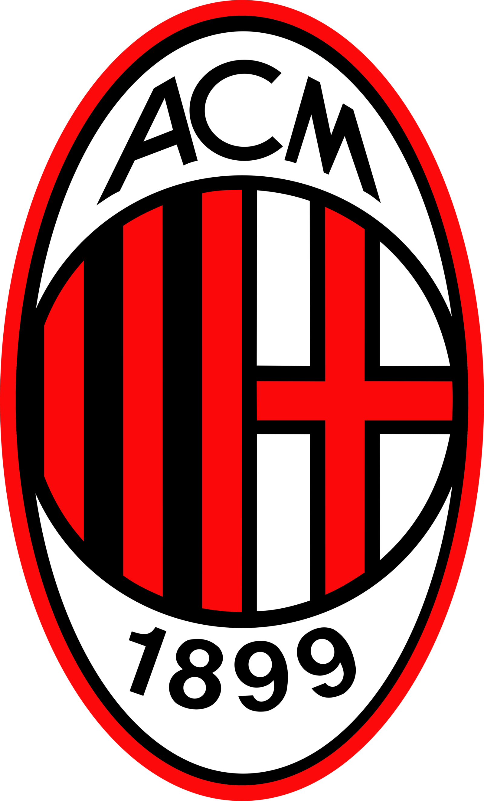
- 1996 — Today The current version of the A.C. Milan visual identity was designed in 1996 and only slightly refined throughout the years.
- All the lines are neat and clean, making the famous football club’s visual identity a truly iconic example, which is instantly recognizable worldwide.





Leave a Review