Uncle Ben’s logo and symbol, meaning, history, PNG
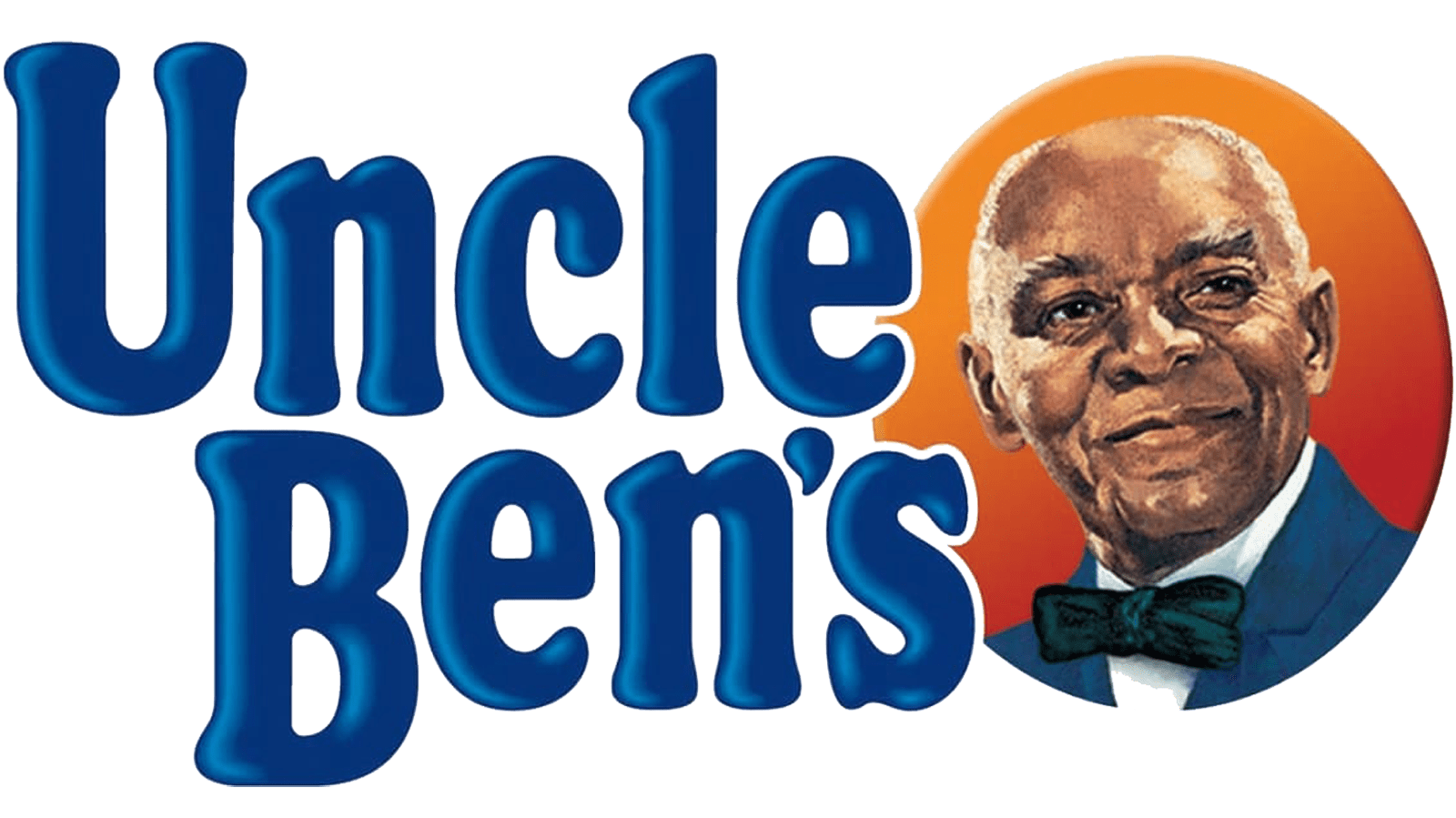
- Download PNG Uncle Ben’s Logo PNG Uncle Ben’s logo and brand identity have been often criticized for being racially charged.
- According to several sources, there was a Houston rice farmer called Ben who was known for his exceptionally high-quality rice.
- When the businessmen saw Brown, they decided he would look great on the packaging, and he agreed to pose for the portrait.
- While the logo has always featured Brown’s face, the details of the picture and the typography have been modified more than once during the product’s 70-plus years of history.
- 1990s This version already looks pretty much like the current one.
- Here, Uncle Ben is wearing a jacket and a bow tie and is placed inside an orange circle paired with a dark blue banner.
- Also, you can see the name of the product in a plump and cozy serif type with prominent rounded serifs.
- Uncle Ben’s head was now tilted in the opposite direction, and there was no banner.
- Both the bow tie and the jacket have disappeared, so no he is wearing only a white shirt.
- The color of the letters has grown darker.
- Because of these controversial facts, the company did not use this image in ads after the civil rights movement took hold – the Uncle Ben’s logo was silent, it could only be seen on the packages.
- Yet, in 2007, Masterfoods and its advertising agency, TBWA/Chiat/Day, decided to change their approach to the problem.
- They “promoted” Ben and made him a chairman of the board, an accomplished businessman with an opulent office and other signs of his status.
- The magazine ads contained the slogan “Ben knows best,” while the character himself had the chairman’s title affixed on a plaque.


Leave a Review