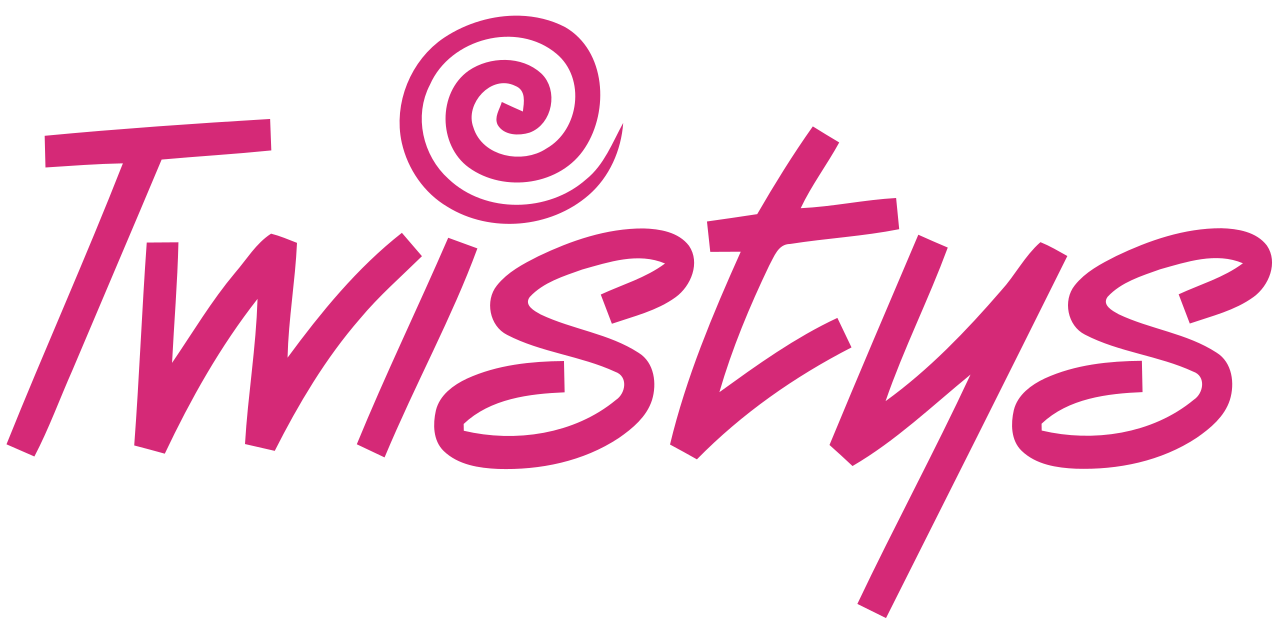
Twistys logo and symbol, meaning, history, PNG
- Download PNG Twistys Logo PNG The vivid colors and playful shapes of the Twistys logo leave a youthful and light impression.
- Arguably, the most eye-catching element of the emblem is the dot above the “i” looking like candy.
- The sweet theme is emphasized by the palette.
- The designer of the logo opted for a bright and cheerful tint of pink and placed it on the white background.
- The letters themselves are as playful as the colors are.
- None of them looks like a regular letter but rather something that has been written by hand.


Leave a Review