StarCraft 2 logo and symbol, meaning, history, PNG
- This real-time strategy game has its fans all over the globe and is available for both Windows and macOS operating systems.
- Meaning and history The StarCraft 2 logo repeats the visual identity of the game’s first part and o my adds a Roman “II” sign to accent on the sequel.
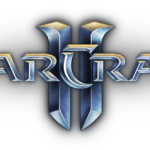
- The StarCraft 2 logo is composed of a three-dimensional wordmark in all the capital letters, with “S” and “C” enlarged.
- The nameplate is executed in a smooth futuristic typeface, which was replicated by Neale Davidson in his StarCraft font.
- The Roman “II” sign is placed behind the wordmark and is executed in smooth entry confident lines, which tops are slightly curved.
- The gray color palette of the StarCraft 2 logo makes the inscription look alive and dynamic.
- The StarCraft 2 logo is a traditional yet actual and memorable example of a video game visual identity design.
- It looks strong and confident on any placement and fully reflects the plot of the game and its mood.


Leave a Review