Scratch logo and symbol, meaning, history, PNG
- Download PNG Scratch Logo PNG Scratch is the name of the children-oriented website, specialized in programming and coding.
- The language was first introduced in 2003 by MIT Media Las and today is considered to be one of the best educational sources for kids in learning the code.
- 2006 – 2007 The very first logo for Scratch was introduced in 2006 and only stayed with the brand for a year, as it was a monochrome badge with the inscription in all capitals in it.
- The lettering featured uneven lines and a playful serif typeface, which looked cool and progressive, pointing to the creativity and the children-oriented approach of the product.
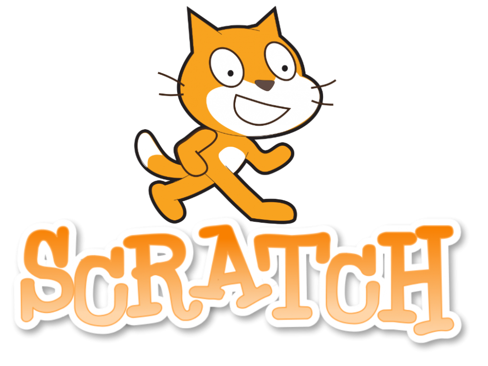
- 2007 – 2013 The redesign of 2007 brought a new palette to the Scratch logo, and now it was ex-ecuted in gradient orange and white, where the main text featured orange lines, outlined in white, and with a distinct light gray shadow, which added volume to the logo, making in layered and three-dimensional.
- 2011 In 2011 another version of the logo was created, but it was barely used by the brand.
- The logo featured the same orange and white color palette, but with thinner orange lines and the wider white part.
- 2013 – 2015 The logo, designed in 2013, was based on the version from 2011, but with no gradient colors and gloss.
- The new palette made the Scratch emblem look fresher and bolder.
- 2015 – Today The redesign of 2015 kept the style and contours of the previous version, but changed its color palette, making the logotype white and placing it inside a thick and solid orange badge, repeating the contours of the lettering.
- Font and color The handwritten playful Scratch typeface is a combination of a traditional typewriter-style font with its long serifs, and kids drawing, where there are no straight lines.
- The inscription looks friendly and funny, being memorable and recognizable by kids and parents all over the globe.
- This color combination is soft and tender, yet also dynamic and progressive, standing for growth, development, and fun learning.
- Video





Leave a Review