Saab logo and symbol, meaning, history, PNG
- That was a period when the brand used a famous Red Griffin for its emblem.
- 1911 – 1937 The redesign of 1911 made the colors more intense and the red Griffin head bigger, thus it started being more visible and became the main element of the badge.
- 1937 – 1946 The “Saab” wordmark was first introduced on the badge in 1937.
- It was a very simple logo with the schematic image of a plane drawn in thin black lines on a plain background, and the logotype arched under it.
- The lettering was executed in the uppercase of a modern and bold sans-serif typeface with a pretty recognizable letter “S” and a lot of space between the symbols.
- The brand used two versions of the logo — the traditional one, blue and silver, and the one, that featured only silver-gray color.
- 1963 – 1965 The new logo from 1963 featured silver “Saab” lettering above the airplane emblem executed in the same color.
- The lettering mover to the upper part of the badge, getting bolder and changing its typeface to a more confident and solid narrowed sans-serif.
- Now it is enclosed in a square silver frame with rounded angles and resembles the very first Saab badge.
- The lettering of the wordmark is arched and looks dynamic and confident.
- 1969 – 1974 Starting in 1969 the brand took the name “Scania” and used it on its official logo.
- It was a simple yet modern and cool uppercase logotype in an extra-bold sans-serif typeface with clean distinct shapes.
- 1974 – 1996 For 13 years, starting in 1974, Saab uses a minimalist and laconic wordmark as its logo.
- The traditional sans-serif typeface of the capital letters looks bold and masculine.
- The Griffin era of the Saab visual identity starts in 1987 after the merger of Saab and Scania.
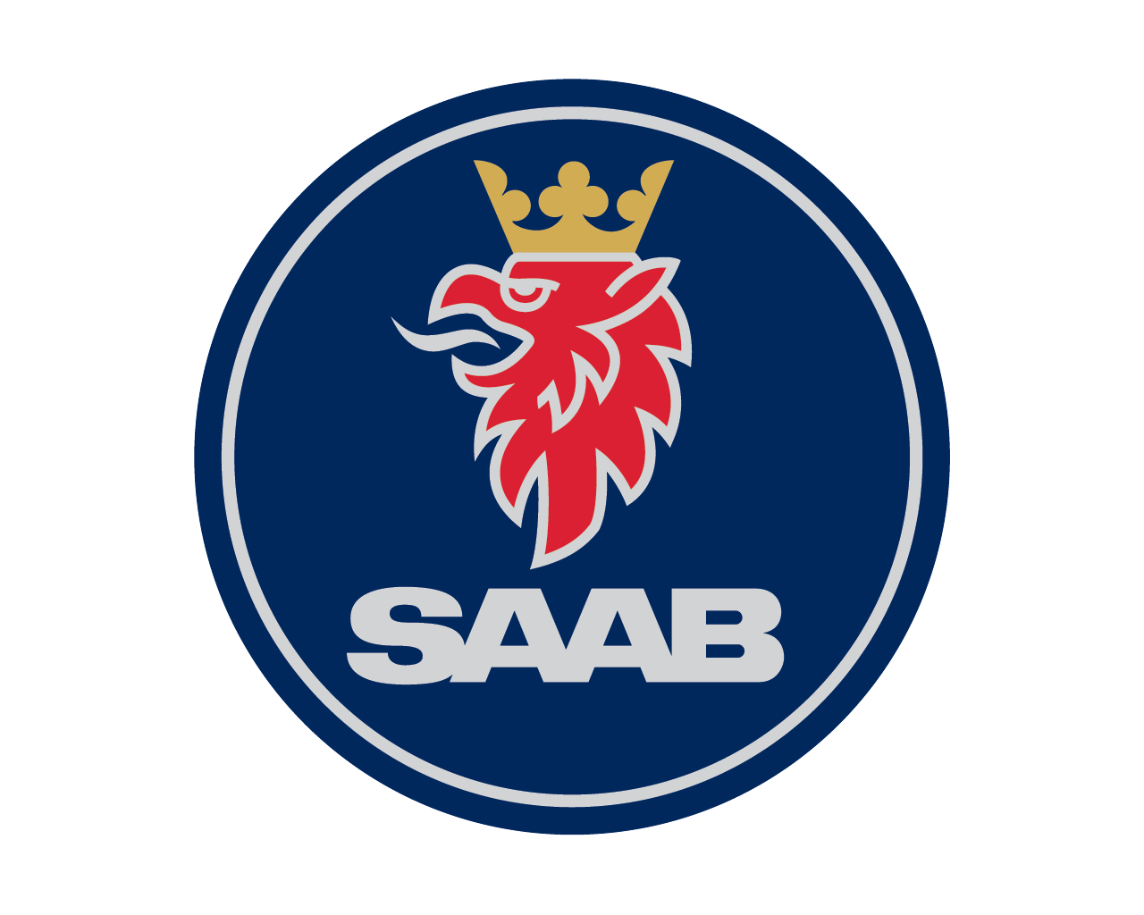
- The Saab emblem now features a dark blue circle with a Red Griffin head in the center and two thin silver circles, which add movement to the logo.
- The Saab wordmark is placed on the top part of the emblem, above Griffin’s head, while the Scania nameplate is placed underneath it.
- The Griffin’s head is enlarged, as well as Saab lettering, which is now located beyond it.
- The badge stays with the brand for almost ten years.
- The Saab logo snow is composed of a bold and strict wordmark with thick lines of the letters, executed in a light gray color.


Leave a Review