Quem Disse logo and symbol, meaning, history, PNG
- Today the label operates all over the country, having its website with the whole range of products available for international customers.
- The brand’s main specialization is make-up items, but it also sells fragrances and beauty accessories.
- Meaning and history The philosophy of the Brazilian cosmetic brand has always been based on friendliness and playfulness.
- Starting with its funny name Quem Disse, Berenice?
- which is translated from Portuguese as “Who Said Berenice”, and finishing with its colorful products, everything about the label is memorable and cool.
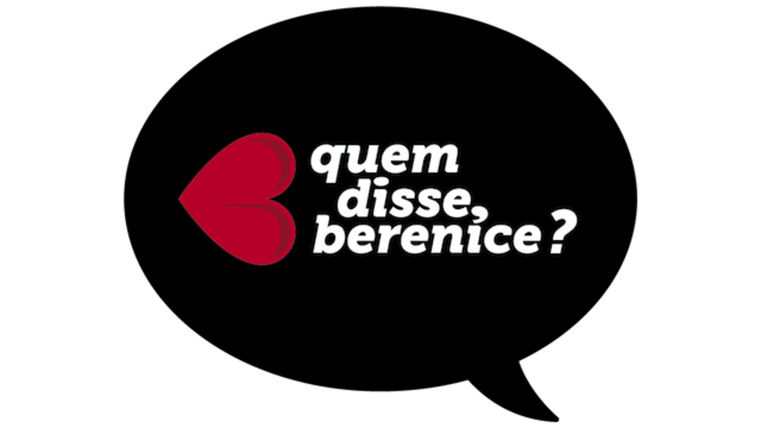
- 2012 — 2019 The very first logo for the company was introduced in 2012 and featured a cursive inscription in the lowercase, set in three levels, with a bright fuchsia emblem on the left.
- The iconic emblem is a horizontally placed heart, with its peak pointing to the left.
- It looks girly and fancy, reflecting the brand’s purpose and the colorful palette of its products.
- As for the lettering, on the first version, it was executed in a smooth and bold cursive, with thickened ends of the lines and rounded edges.
- 2019 — Today The redesign of 2019 kept the original composition but elevated and modernized it.
- The color of the image is now black, which looks trendy and stylish.
- The Quem Disse Berenice wordmark is now set in just two levels and executed in an ExtraBold sans-serif typeface with thick lines and clean edges.
- It makes the whole logo more friendly and welcoming.
- The monochrome color palette is a big step forward from the bright pink of the first logo.


Leave a Review