Plan logo and symbol, meaning, history, PNG
- Download PNG Plan Logo PNG Plan is the name of an international non-profit organization, which was established in 1937 with the idea to fight for the right of children all over the globe.
- Today it operates in more than 70 countries and is focused on not only kids’ protection, but also gender equality and girls’ rights.
- Meaning and history The Plan International visual identity is unique and memorable.
- It’s traditional for non-profit organizations blue and white color palette doesn’t make it boring, the logo still looks strong and is instantly recognizable all over the globe.
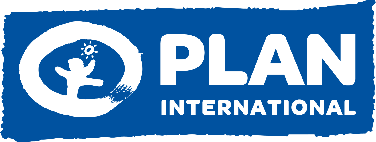
- The Plan logo is composed of an emblem and a wordmark, which are sometimes drawn in white and set in one line on a white background, but more often — in blue, with lettering placed under the enlarged emblem.
- The emblem is composed of a stylized childish drawing of a kid and the sun placed in a very thick blue circular frame.
- It shows the happy childhood and the warmth, which the organization tends to give to all the kids in the world.
- The wordmark in the title case is written in the same blue color and also featured extra thick lines, which looks balanced and not overloading.
- It is executed in a bold rounded sans-serif typeface, which is very similar to such fonts as Big Softie and VAG Rounded Next ExtraBlack, but with the letter, “A” modified and softened.
- The Plan logo is something kind and very optimistic.
- It shows the organization’s purpose and intentions and makes you believe everything is possible.


Leave a Review