Mississippi Braves logo and symbol, meaning, history, PNG
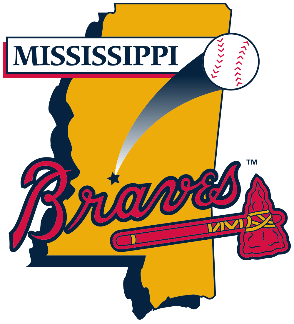
- Download PNG Mississippi Braves Logo PNG The logo of the Mississippi Braves is heavily based on that of their parent club, the Atlanta Braves.
- And yet, the emblem of minor league team possesses a unique identity.
- Meaning and history The M-Braves started playing in 1984 as the Greenville Braves.
- In 2005, they relocated to Pearl, Mississippi (a suburb of Jackson) and adopted their current name and logo.
- Similar to the parent team’s emblem, there’s a red tomahawk with gold and dark blue elements and a scripted word “Braves” above.
- We can also see a star pointing at the club’s hometown on the map and a white baseball.
- Alternative emblems The same red tomahawk appears on the cap logos.
- Colors While borrowing navy blue, scarlet red, gold, and white from the parent team’s emblem, the Mississippi Braves logo also adds black and several lighter shades of blue.


Leave a Review