Manitoba Moose logo and symbol, meaning, history, PNG
- Download PNG Manitoba Moose Logo PNG The Winnipeg-based team Manitoba Moose belongs to the American Hockey League and has the NHL’s Winnipeg Jets as its parent club.
- Meaning and history 1996 — 2001 The original Manitoba Moose logo, which was introduced for the 1996/97 season, featured an anthropomorphized moose, who, in spite of the hockey stick, looked more like a tourist on a winter resort than a determined hockey player.
- 2001 — 2005 The same could be said about the 2001/02 logo, which differed from the original only in its color palette.
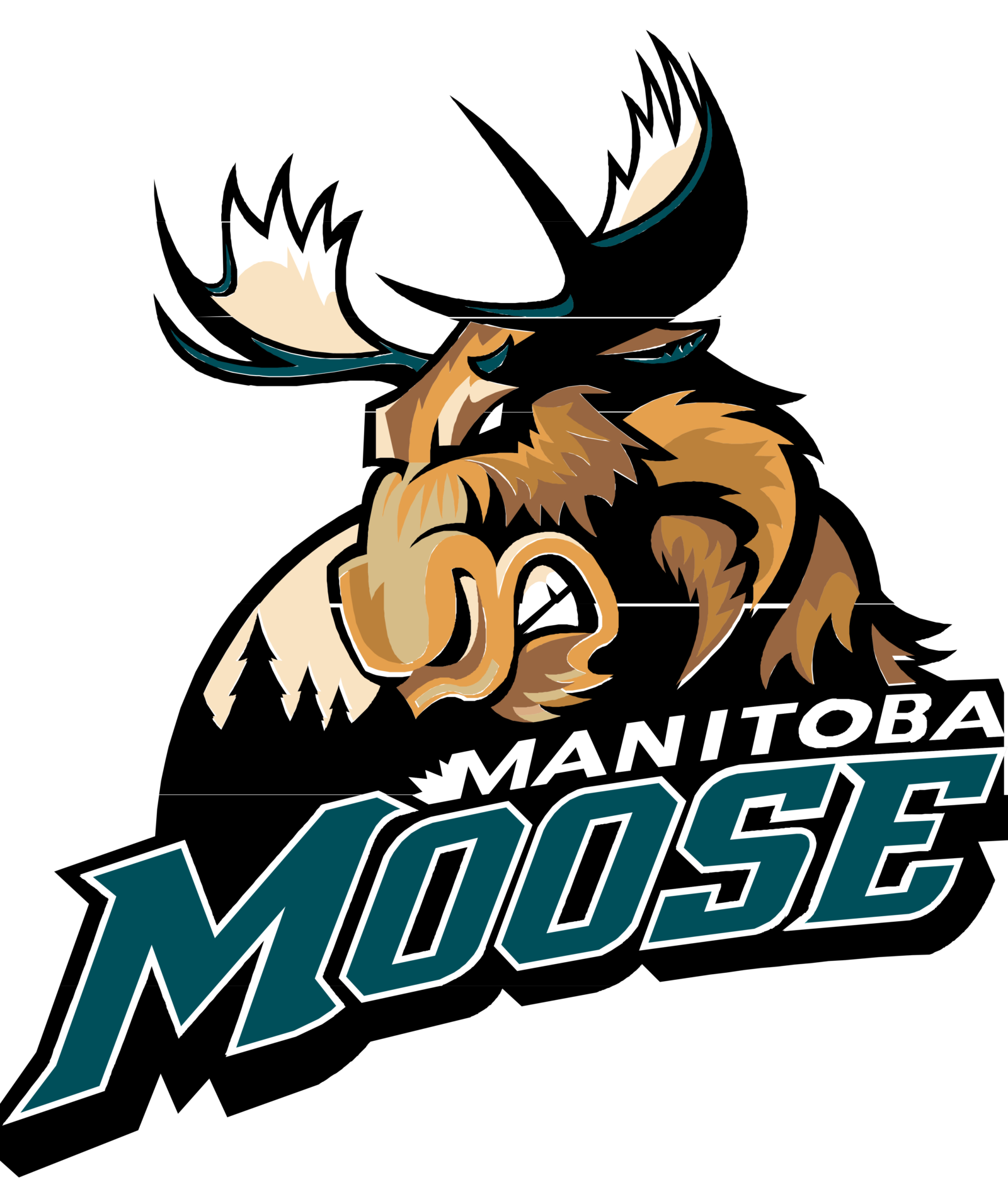
- 2005 — 2011 In advance of the 2005/06 season, though, the team adopted an emblem with an aggressive moose, which looked more like a sports emblem.
- The only modification so far has been a shift to a new color palette before the 2015/16 season.
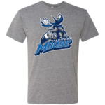
- 2015 — Today The redesign of 2015 switched the color palette of the Manitoba Moose logo to blue and gray, which made the emblem look colder and fresher.
- The contours of all the elements were cleaned and emboldened, hence the refined logo started looking more confident and professional.
- Colors The Manitoba Moose logo features cool, discreet shades, including Polar Night Blue, Aviator Blue, two shades of grey, and white.





Leave a Review