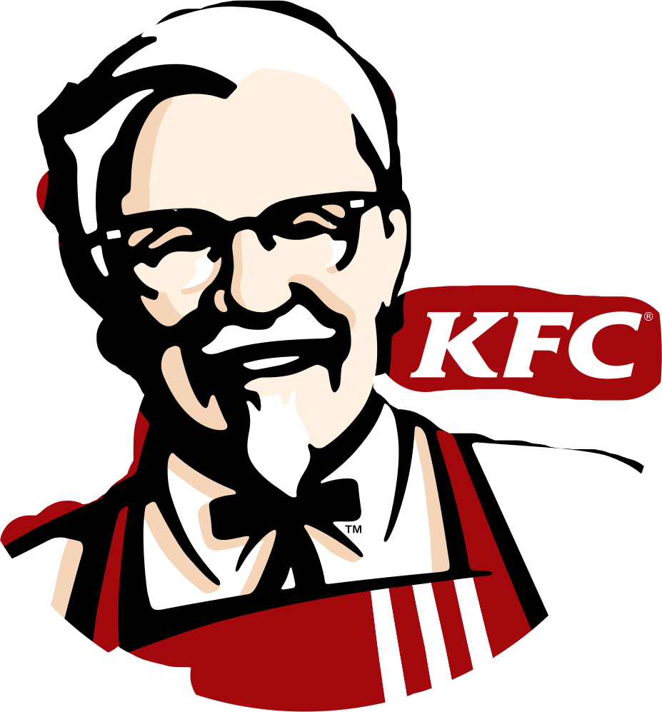
KFC logo and symbol, meaning, history, PNG
- Download PNG KFC logo PNG The fast food restaurant chain KFC specializing in fried chicken has over 20,000 restaurants all around the world.
- In terms of sales it is beaten only by McDonald’s.
- Brands, which is also the owner of Pizza Hut and Taco Bell.
- From that time on, the stylized face of Colonel Sanders, the founder of the fast food chain, has been an essential part of the company’s branding.
- The logo was black and white.
- The name of the restaurants, “Kentucky Fried Chicken”, was included in the emblem as it is.
- Next to the face, there was a “Kentucky Fried Chicken” inscription, this time in a bit different type.
- “Colonel Sanders” featured on the KFC logo is not a fictional character but the actual founder of the company, Colonel Harland Sanders.
- Sanders started selling fried chicken from his restaurant in 1930.
- 1952 – 1978 The original KFC logo was designed in 1952 and featured a wordmark, Kentucky Fried Chicken, is a hand-drawn typeface with enlarged first letters “K”, “F” and “C”.
- The KFC emblem, which is a Colonel Sanders portrait, was placed on the fight of the wordmark.
- The color palette is monochrome, which makes the logo look timeless and stylish.
- 1978 – 1991 The first logo redesign of 1978 put the emblem on the left side on the wordmark, which was now written in three floors, using enlarged lettering.
- 1997 – 2006 In 1997 the KFC logo was redesigned by Landon Associates agency.
- It is now composed of a square emblem featuring a red and white background with the Colonel’s portrait and KFC wordmark in red, placed on his tuxedo.
- The KFC wordmark in white is placed on the left of the Colonel’s face.
- During this period the company also uses a monochrome version of the emblem, like a tribute to the original logo from 1952.
- 2014 – 2018 The KFC logo from 2014 featured all the iconic elements on their places but executed in a monochrome color palette and with not many additional details.
- 2018 – Today The last redesign of the KFC logo was in 2018.
- Color Basically, the color scheme (red, black, and white) has stayed the same since the 1991 version of the logo was created.


Leave a Review