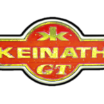
Keinath logo and symbol, meaning, history, PNG
- Download PNG Keinath Logo PNG Keinath is a German brand of the automaking company, which was established in the 1980s, and is specialized in the production of convertible and sport-cars.
- Meaning and history 1983 – 1988 The initial Keinath badge was introduced in 1983.
- It was the most stylish and minimalist logotype of all, created for the automaker throughout its history.
- The first insignia featured simple black lettering on a plain white background.
- The lettering was set in a title case, and used a slightly italicized custom Sans-serif typeface with square futuristic shapes and the elongated lines of the first letter “K” and the last “H”.
- 1988 – 1993 The redesign of 1988 kept the recognizable contours of the Keinath badges but made the letters thick and three-dimensional, drawing them in gradient silver and outlining each symbol in black.
- The letters got wider and less space was used between them, thus the new badge was heavier yet more solid and stable than the previous version.
- 1993 – Today The Keinath visual identity is one of the examples of the timeless classic, with very traditional shapes and color scheme chosen.
- It is composed of a laconic yet chic badge with a lettering and a small geometric symbol on it.
- The scarlet-red emblem of the automaker has a shape of a circle overlapping an elongated horizontally placed rectangle with its sides cut diagonally, resembling two wings.
- The badge had a double outline — thick gold inside a thin black one — and golden lettering.
- It was something looking like the Russian letter “Ж”, simply composed of two mirrored “K” in the lower case.
- The red, gold, and black color palette of the brand’s logo was a representation of a luxury segment and professional approach to the design and production of the company’s cars.
- Think black accents point to the authority and expertise of the company.


Leave a Review