Huddersfield Town logo and symbol, meaning, history, PNG
- It joined the Premier League in 2017.
- It was a traditional crest surrounded by ribbons and ornaments and executed in a white, blue, and yellow color palette.
- 1969 — 1971 The logo from 1969 featured a light circular badge (could be seen both in white and ivory shades) with a solid red image of a dog and “The Terriers” uppercase inscription in a bold sans-serif typeface, written in the same shade of red under the animal’s silhouette.
- 1971 — 1975 The initial crest was returned to the Huddersfield Town club logo in 1971, but redrawn in a more modern way and placed on a circular medallion with a wide blue framing, where the full-sized uppercase lettering in yellow sans-serif was written around the perimeter.
- As for the central part of the badge, it was white, with thick yellow lines creating patterns on it.
- It was again a vertically placed rectangle in a deep and bright shade of blue with white cursive letters placed on it vertically, one under another with a slight shift to the right.
- It was a vertically oriented oval in a thick red frame with a thin gold outline.
- The “Huddersfield Town AFC” inscription in the uppercase of a narrowed sans-serif typeface was written along the bottom part of the red framing, arching under the main part of the badge.
- The main element was now a geometric shield with a blue and white pattern on its upper part, a black chevron with two stylized footballs, and a dark gold bottom part with a white tower drawn on it.
- The shield was surrounded by leaves and ribbons in blue and white, with the thin blue ribbon under the crest, where the uppercase sans-serif inscription in white was set.
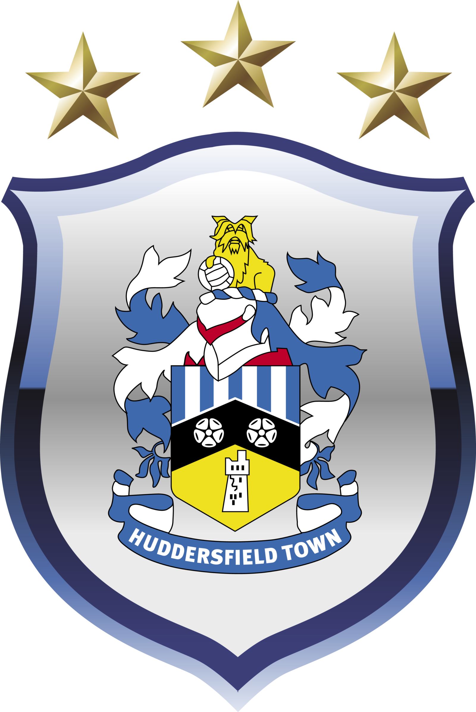
- 2000 — 2002 In 2000 the logo of the football club got back to the circular shape with all the colored elements enclosed into a thick white frame with lightweight black lettering in a modern sans-serif typeface written along the bottom part, and three gold five-pointed stars in a thin black outline — on top.
- The upper part of the circle featured a vertical striped pattern in blue and white.
- 2002 — 2005 The redesign of 2002 brings back the ornate badge from 1980, redrawing it in a modern way and adding gradients shades, and gloss to some elements, which created a three-dimensional image full of life and motion.
- The lettering on a blue ribbon became bigger and bolder, changing its typeface to a solid and masculine sans-serif, with not much air between the capital letters of the wordmark.
- The gold elements of the badge changed their color to bright yellow.
- 2005 — 2019 In 2005 the ornate Huddersfield Town badge was placed on a solid white crest in a thick blue framing.
- The crest featured elegant lines and pointed angles and had three five-pointed stars in bright yellow placed above it.
- Font and color The classy and traditional Huddersfield Town badge has its nameplate placed under it, on a thin blue ribbon, and this arched white inscription looks delicate and modest despite the pretty thick lines and confident shapes of the symbols.
- The ornate heraldic Huddersfield Town crest has two main colors, white and blue, and they are accompanied by black and gold details of a small geometric part with datemark and red and yellow accents on the crest itself.
- The blue and white combination stands for loyalty and responsibility, while red is for passion, and yellow symbolizes energy.


Leave a Review