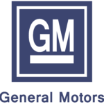
GM logo and symbol, meaning, history, PNG
- And the “Certificate of Incorporation” inscription in a Gothic typeface, located in the middle.
- The upper and bigger part with a black background contained the “GM” lettering, while the lower one, in white, had a “General Motors” inscription on it.
- The “GM” wordmark was executed in a classic serif font with confident and elegant lines and pointed corners, while the “General Motors” in all capital letters used a more modern and smooth sans-serif typeface, balancing the traditional style of the nameplate.
- 1964 – 2021 In 1964 the GM logo was redesigned.
- It became even simpler and more minimalist.
- Now it is a blue square with rounded angles and a white underlined wordmark on it.
- The wordmark is composed of just “GM” lettering, executed in a traditional Helvetica typeface.
- 2001 – 2010 In 2001 the GM emblem was made three-dimensional and the blue color of the background was made more intense.
- It got a more even tone of the background, which gained a matte-metallic blue color.
- The wordmark is now shadowed with black, which makes the letters more dynamic.
- The blue and silver-white color combination reflects the brand’s professionalism and trustworthiness, representing expertise and confidence.
- Here, there was the full name of the brand in a minimalist sans with slightly rounded letters.
- 2021 – Today The GM logo adopted a friendly and tech touch.
- For one, the square frame with rounded corners makes it look like a button or an icon.


Leave a Review