Gatorade logo and symbol, meaning, history, PNG
- Download PNG Gatorade Logo PNG Since the 1970’s redesign, the Gatorade logo did not change that much until 2008, when a completely new design was introduced.
- Meaning and history The Gatorade visual identity has been using one symbol, which became iconic, since the 1970s.
- Before that, the brand had only one logo version, created in 1965, and it was more a trial badge.
- 1965 – 1970 The original Gatorade logo was introduced in 1966 and featured monochrome lettering set in four levels.
- The banner featured “Stokely” on the top level, executed in a massive serif font, “Van Camp’s” under it, in smaller lettering, “Finest” in cursive with elongated lines, and, finally, “Gatorade”, placed on the bottom level and executed in a bold sans-serif font, using capital letters.
- 1970 – 1986 The rebranding of 1979 brought an iconic colorful symbol to the Gatorade visual identity.
- The logo of these years was composed of a bold green wordmark in a black outline, enclosed in a thin orange rectangular frame, with a solid orange lighting bolt coming through it.
- There was also a blue “Thirst Quencher” tagline in all capitals, placed under the main wordmark inside the frame.
- 1994 – 1998 The redesign of 1994 simplified the logo color palette to just orange and green.
- The tagline is placed under the frame now, and the main wordmark is executed in a bolder sans-serif with smooth rounded lines and straight cuts of the letters.
- The orange lightning bolt gains gradient shades and a thin yellow outline with a green shadow, which adds dynamics and motion to the image.
- 1998 – 2004 The tagline is being removed from the logo in 1998, as well as all the green details.
- Now green is used only for the wordmark, as for all the other color accents — they are made black.
- The gradient of the bolt is back to flat orange, so the composition looks minimalist and laconic.
- The orange lightning bolt is now gradient red, looking more powerful and progressive than ever.
- Symbol in 1991-1998 The iconic lightning bolt stayed the same, while the name of the drink and the lettering “Thirst quencher” were placed not horizontally, but at a sharp angle.
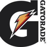
- The version of the Gatorade emblem introduced in 1994 is the most recognizable one.
- Font All the versions feature a custom drawn serif typeface.
- Colors The international version of the Gatorade logo combines dark grey (for the letter), black and two shades of orange (for the lightning bolt), and white for the outline.
- In addition to orange, grey, yellow, black, and white, it also included bright shades of green.


Leave a Review