Contents
Canterbury-Bankstown Bulldogs logo and symbol, meaning, history, PNG
- This is hardly a surprise as the rugby league football team has over 80 years of history, and its name was changed several times, too.
- The crest featured a shield with the letters “C” and “B.” 1978 — 1997 The word “Bulldogs” was adopted in 1978.
- The same year, a roundel emblem with a white bulldog was introduced.
- 1995 It stayed in use until 1997, when the team unveiled another emblem.
- 1998 — 2002 Now, there was only the bulldog’s head and the word “Bulldogs.” 2003 — 2009 The Canterbury-Bankstown Bulldogs logo was redesigned again in 2003.
- The composition remained the same, but the contours of all elements got refined and the bottom part of the emblem — strengthened and emboldened.
- It was now more readable and its modern sans-serif typeface looked powerful and confident.
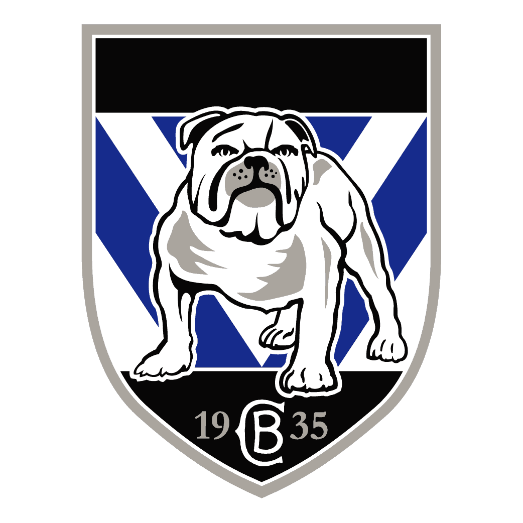
- 2010 — Today Eventually, in 2010, the team adopted a shield with a white, black, and gray bulldog.
- The dog looked somewhat similar to the original one from the 1978 logo, although it was designed at a higher professional level.
- Colors The official palette is as simple as blue and white.
- For most of the team’s history, the jerseys have featured this combination.
- It was only during the Second World War that the blue and white strip was replaced by a maroon background and blue “V.” The modification was the result of rationing.
- As for the Canterbury-Bankstown Bulldogs logo, however, it comprises a couple of additional colors, namely gray and black.
- Video


Leave a Review