BSA Logo and symbol, meaning, history, PNG
- It can’t be said, however, that it had the same luck as its predecessor.
- 1919 – 1946 For the entire length of their bike enterprise, BSA used their acronym as a dominant image of their logotype.
- On the first stage, it was styled differently, however.
- Both on official property and products, it was painted red and was spaced out using the dots.
- There also might be small changes, like the distance between the letters, although essentially the logotype was the same wherever it was used.
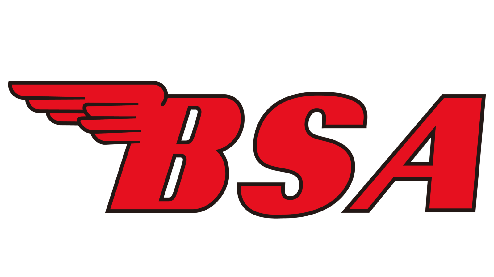
- 1946 – 1972 When BSA launched a new generation of bikes with the BSA A7 after the war, they decided to give it a new emblem.
- This emblem was further used on most property owned by this brand.
- First of all, the dots were removed and the letters were placed closer to one another.
- Secondly, they became tilted to the right a bit.
- But most crucially, the ‘B’ letter was given a wing, which sprouted from its left top corner.
- It was styled as a comb – with differently-sized feathers and even intervals between them.
- The colors might vary, but the company itself mostly used the red-painted variant, although white and black colorings were also frequently used.
- Afterwards, they started using golden stars of different shapes to hold their logotypes on the side of the bikes.
- The most frequent variants are a star with many thick tips and a sheriff star with circles on the ends on the tips.


Leave a Review