evolution history and meaning
- Download PNG Amstel Logo PNG Amstel is one of the famous beer brands from Netherlands, was founded in 1870 in Amsterdam, and was taken over by Heineken in 1968.
- The original Amstel brewing plant closed down in 1972, with production moving to the main Heineken plant at Zoeterwoude.
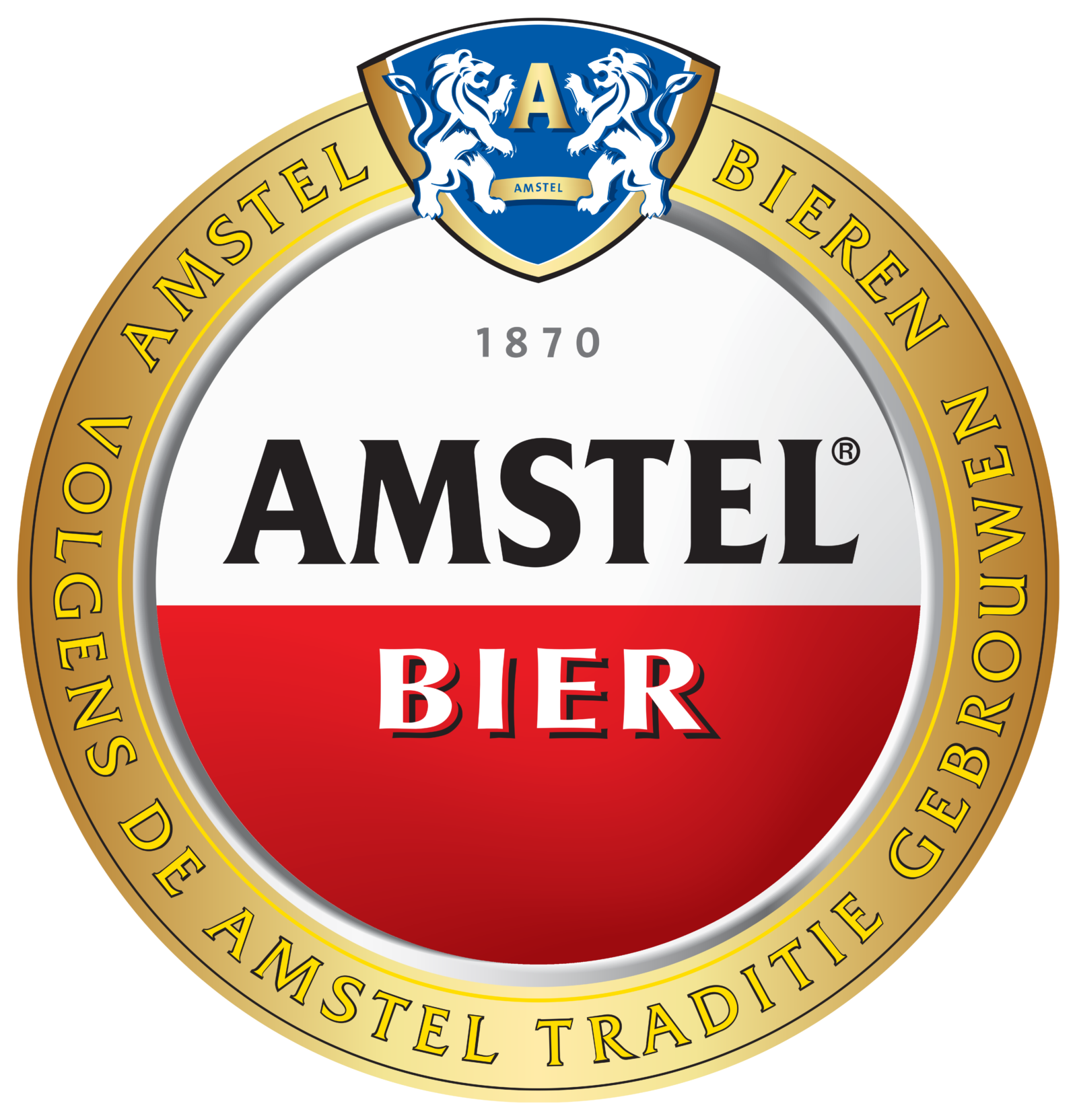
- Meaning and history From it’s foundation, in 1870, Amstel’s brand mark has relied on simple elements to be recognized all over the world: a red half circle enclosed by a golden circle.
- The simple strict forms express the idea of container and support, while the circular shape suggests continuity, the main Amstel’s brand message of timeless quality.
- After the last brands redesign the Amstel logo featured more red color and started looking crispy and powerful, preserving the iconic foundation.
- The minimalistic logo’s color scheme includes two main color – red and white.
- The wordmark is executed in black and the logo round-framing is gold.
- The Amstel logo embraces modernity while preserving the rich heritage of the brand that has been built since 1870, the year of the brand’s creation.


Leave a Review