Clash of Clans Logo and symbol, meaning, history, PNG
- The strategy is considered to be one of the most popular fantasy mobile games in the world and has high ratings.
- Meaning and history Clash of Clans is one of those games coming which value their legacy and prefer their visual identity to stay recognizable and solid.
- The logo was designed for the game in 2012 and has never been changed since then.
- It is fresh and delightful, though brilliantly represents the purpose and plot of the online fantasy game, and what the player can expect from it.
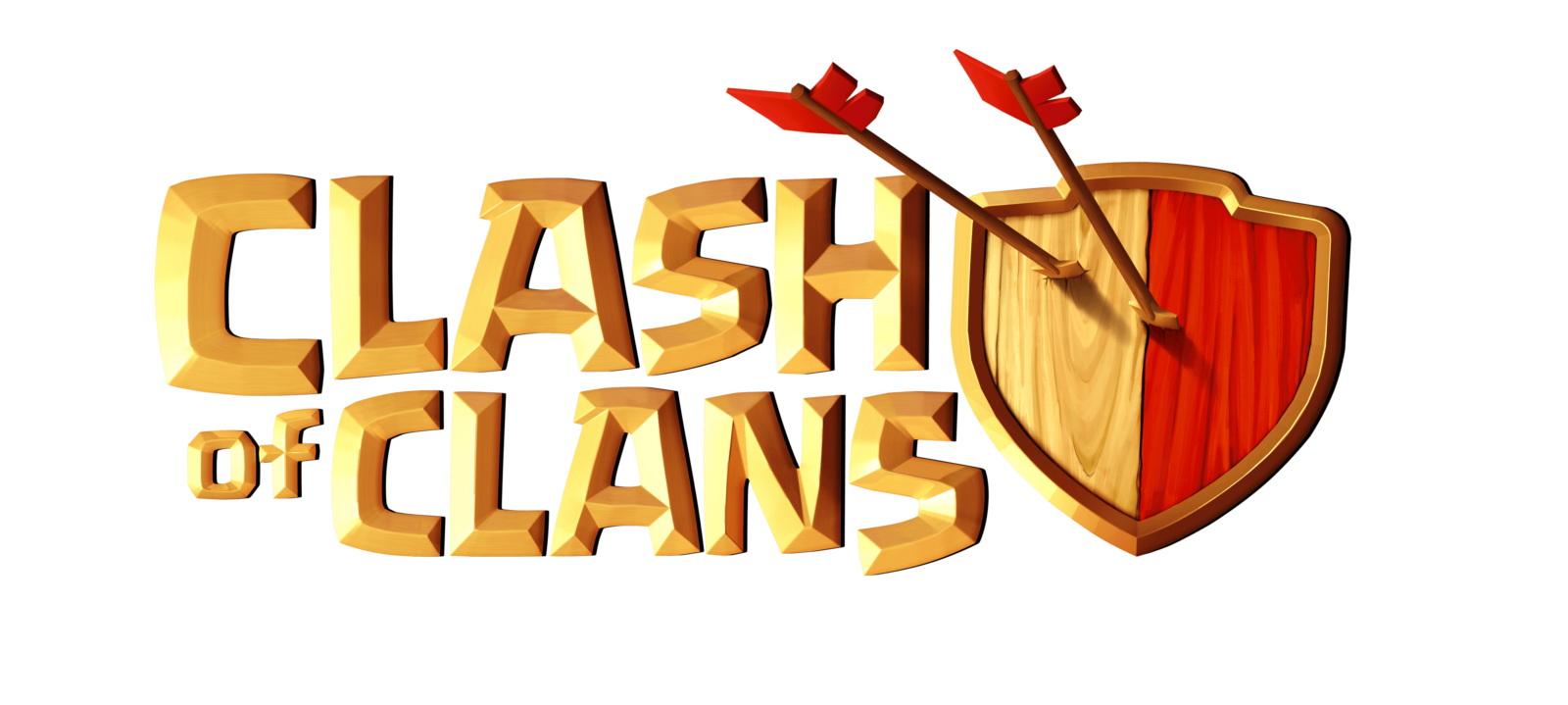
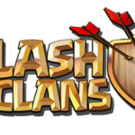
- The Clash of clans logo is composed of stylized bold lettering in two levels placed on the left from a delicate yet confident and solid emblem in a calm color palette.
- The lettering is set in all capitals of a custom sans-serif with voluminous letter shapes and gradient colors in gold and beige palette.
- The bold shapes and thin outline of the wordmark look elegant and playful at the same time, and the slightly jumping letters only elevate their feelings.
- The “Of” part of the game’s name is smaller than others and placed on the left from the main lettering.
- The emblem of Clash of Clans in a classy manner legacy crest with a wooden texture, which is vertically divided into two parts — light beige and red.
- The main thing about the Clash of Clans visual identity is its color palette, which is tender and elegant, though also represent the “historical” direction of the game and shows which kind of gaming experience the player will get after downloading the application.
- As for the mobile app icon of the game, it looks funny and works just great in a contrast with the classy official logo.
- The red square with rounded angles has a caricature portrait of a man in a gold headpiece.
- The man bares his teeth in a scary smile and looks insane, having saliva flowing out of the mouth.
- This Ivón can not be confused with anything else and makes the game stand out in the list of its competitors.




Leave a Review